Ever stared at a Google Sheets chart wondering what those blurry axis labels mean? You're not alone. As a user growth manager constantly analyzing metrics, I know clear data visualization can make or break your reports.
Let me show you how to properly add numbers to your horizontal axis in Google Sheets - plus share how tools like Excelmatic can automate this entire process with AI.
Getting Your Data Ready
Before creating any chart, your data needs to be organized. Think of it like prepping ingredients before cooking:
- Open your Google Sheet (or create a new one)
- Arrange your categories in one column and values in the next
- Remove blank rows or merged cells that could cause issues
Pro tip: Excelmatic can automatically clean and organize your raw data with its AI-powered formatting tools - saving you this manual prep work.
Creating Your Basic Chart
With clean data ready:
- Select your data range
- Click Insert > Chart
- Choose your chart type (column, line, or bar charts work best for horizontal axes)
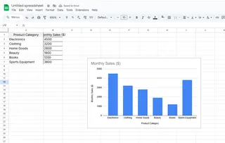
Google Sheets will generate a basic chart, but the horizontal axis might not show numbers correctly yet. That's where customization comes in.
Adding Numbers to the Horizontal Axis
Here's how to fix those missing or messy axis numbers:
- Click your chart to open the Chart Editor
- Under Setup tab, verify your X-axis range includes the correct data
- Switch to Customize tab > Horizontal axis section
- Adjust formatting, labels, and scale as needed

With Excelmatic, this entire process happens automatically. Just describe what you want ("show monthly sales trends") and it generates perfectly formatted charts with clear axis labels.
Making Your Charts Shine
Now for the fun part - design! Consider:
- Color schemes that match your brand
- Axis titles for clarity
- Gridlines to emphasize key data points
- Data labels for precise values (but don't overdo it)
Excelmatic offers smart styling suggestions based on data type and best practices - no design degree required.
Pro Tips for Complex Data
Working with lots of data? Try:
- Aggregating (show weekly instead of daily numbers)
- Filtering to highlight specific time periods
- Dynamic formulas that auto-update your charts
For date-based data, ensure your cells are properly formatted as dates first. Excelmatic's AI can automatically detect and format dates/times correctly.
Why Stop at Google Sheets?
While Google Sheets works, tools like Excelmatic take data visualization to the next level by:
- Automatically cleaning and organizing raw data
- Generating interactive dashboards from simple prompts
- Offering smarter chart recommendations
- Enabling real-time collaboration
As someone who lives in spreadsheets daily, I've found AI tools like Excelmatic transform hours of manual work into minutes of automated insights.
Ready to upgrade your data visualization game? Try Excelmatic today and see how easy chart-making can be. Your future self (and your audience) will thank you!

