Bar graphs transform boring spreadsheets into visual stories anyone can understand. But here's the problem - without numbers directly on the bars, your audience is left guessing the exact values.
At Excelmatic, we help teams create smarter data visualizations daily. Today I'll show you the exact steps to add data labels that make your Google Sheets graphs crystal clear.
Step 1: Set Up Your Data Like a Pro
Before creating magic, you need organized data:
- Open a new Google Sheet
- Create two columns:
- Column A: Categories (months, products, etc.)
- Column B: Values (sales numbers, percentages)
- Keep it clean - no blank rows or merged cells
Pro tip: Freeze your header row (View > Freeze) so you never lose track of your labels when scrolling.
Step 2: Create Your Basic Bar Chart
Here's where the fun begins:
- Highlight your data range
- Click Insert > Chart
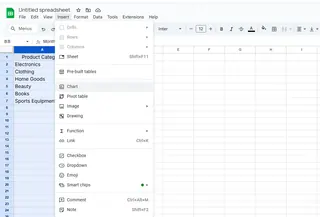
- In the Chart Editor sidebar:
- Under "Chart type," select "Bar chart"
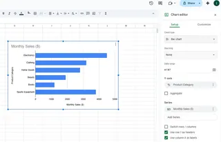
Boom! You've got a basic bar graph. But we're just getting started.
Step 3: Add Those Game-Changing Data Labels
This is the secret sauce:
- Click on your chart
- Open the Chart Editor (three dots > Edit chart)
- Go to Customize > Series
- Check the "Data labels" box
Suddenly, your bars show exact values - no more guessing!
Level Up Your Labels
Make your labels pop with these tweaks:
- Font size: Make them readable (but not obnoxious)
- Color: Choose high-contrast colors
- Position: Try inside or outside bars for best fit
Common Problems (And How to Fix Them)
🔴 Labels overlapping?
- Reduce font size
- Switch to horizontal bars
🔴 Graph not updating?
- Check your data range includes new cells
- Refresh the page
Why Stop at Google Sheets?
While Google Sheets works, imagine having AI do all this for you instantly. That's where Excelmatic shines:
- Automatically suggests the best chart types
- Adds smart data labels with one click
- Updates visuals in real-time as data changes
No more manual tweaking - just beautiful, informative graphs that tell your data story perfectly.
Final Pro Tips
- Keep it simple - only highlight key data
- Use consistent colors that match your brand
- Always double-check label readability
Want to take your data viz to the next level? Try Excelmatic's AI-powered charts and see how much time you can save. Your future self (and your boss) will thank you!

