Pie charts are the MVPs of data visualization - they turn boring numbers into colorful, easy-to-digest visuals. Whether you're presenting sales figures or survey results, a well-labeled pie chart can make your data instantly understandable.
At Excelmatic, we know how crucial clear data presentation is for business decisions. That's why we're breaking down the simple steps to create perfect labeled pie charts in Google Sheets (though if you want to skip the manual work, our AI-powered tool can generate these visuals automatically from your raw data).
Getting Your Data Ready
First things first - organize your data like a pro. Your spreadsheet needs just two columns:
- Column A: Categories (like "Product A", "Product B")
- Column B: Values (sales numbers, percentages, etc.)
Pro tip: Keep it clean. Messy data means messy charts. If you're working with complex datasets, Excelmatic can automatically clean and structure your data before visualization.
Creating Your Basic Pie Chart
Here's the quick 3-step process:
- Highlight your data (cells A1 to B6 in our fruit store example)
- Click Insert > Chart in the menu
- In the Chart Editor, select "Pie chart"
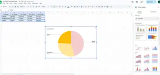
Boom - instant visualization! But we're just getting started.
Adding Labels Like a Boss
Labels are what turn a pretty picture into useful information. Here's how to add them:
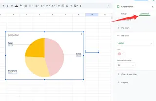
- Click your chart to open the Chart Editor
- Go to Customize tab > Pie chart section
- Check "Slice label" and choose what to show:
- Value (raw numbers)
- Percentage (slice sizes)
- Both (our recommended setting)
Fun fact: In Excelmatic, you can customize these label settings with one click using our smart visualization presets.
Making It Pretty: Customization Options
Now let's make your chart presentation-ready:
- Font style: Match your company branding
- Label position: Inside for minimalism, outside for clarity
- Text color: Ensure readability against slice colors
- Legend: Position it where it makes most sense
Pro designer move: Use Excelmatic's theme builder to automatically apply your company colors and fonts across all charts.
Why This Matters for Your Business
A well-labeled pie chart isn't just pretty - it's powerful. For example:
- Spot which products are your top performers
- Identify underperforming categories
- Make data-driven inventory decisions
With Excelmatic, you can set up automatic chart updates so your visuals always reflect the latest data - no manual refreshing needed.
Common Mistakes to Avoid
Even simple pie charts can go wrong:
- Slice overload: Keep it to 5-7 max categories
- Color confusion: Use distinct, consistent colors
- Missing labels: Every slice should be clearly identified
Our Excelmatic users love the built-in "Chart Check" feature that automatically flags these issues before presentation time.
Level Up: Advanced Labeling Tricks
For the data nerds (we see you):
- Dynamic labels that update with your data
- Conditional formatting to highlight key metrics
- Interactive elements for presentations
These normally require complex formulas, but Excelmatic makes them accessible with simple toggle switches.
Sharing Your Masterpiece
Google Sheets makes collaboration easy:
- Click Share in the top-right
- Add your team's emails
- Set permissions (view/edit/comment)
Bonus: Excelmatic takes this further with real-time collaborative dashboards and automated report distribution.
The Smart Alternative: Let AI Do It
While Google Sheets pie charts are great, creating them manually takes time. Excelmatic's AI can:
- Instantly generate perfectly labeled charts from raw data
- Apply smart formatting automatically
- Update visuals in real-time as data changes
- Create entire dashboards with one command
Why spend hours tweaking charts when AI can do it in seconds? Our users typically save 5+ hours per week on reporting tasks.
Final Thoughts
Adding labels to pie charts in Google Sheets is simple once you know the steps. But if you're creating these visuals regularly for business, consider upgrading to a smarter solution.
Excelmatic combines the familiarity of spreadsheets with AI-powered automation - letting you focus on insights instead of manual chart tweaking. Whether you need one pie chart or a complete reporting dashboard, we've got you covered.
Ready to transform your data visualization? Try Excelmatic free today and see how easy data storytelling can be.

