Pie charts are the go-to when you need to show proportions at a glance. But let's be real - an unlabeled pie chart is about as useful as a speedometer without numbers. Those colorful slices mean nothing unless you know what they represent.
Good news: Adding labels in Google Sheets is easier than you think. Even better? With AI tools like Excelmatic, you can automate the entire process while getting pro-level results. Here's your complete guide.
Why Labels Matter More Than You Think
Before we dive into the how-to, let's talk about why labels are non-negotiable:
- Context is king: A blue slice could mean "Q1 Sales" or "Office Supplies" - labels remove the guesswork
- Better decisions: Stakeholders can instantly understand your data story
- Professional polish: Labeled charts look more credible in presentations
The Manual Method: Adding Labels in Google Sheets
For those who prefer hands-on control, here's the step-by-step:
Set up your data:
- Column A: Categories (e.g., "Product A", "Product B")
- Column B: Values (e.g., sales numbers)
- Pro tip: Keep your data clean - garbage in, garbage out
Create your chart:
- Highlight your data
- Click Insert > Chart
- Select "Pie chart" from the Chart Editor
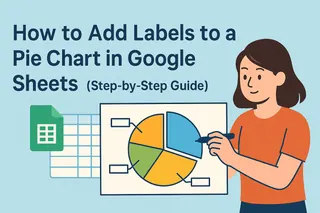
Add the labels:
- Click your chart > Chart Editor > Customize tab
- Under "Pie chart", find "Slice label"
- Choose what to show: Category, Value, Percentage, or combo
Make it pretty:
- Adjust font size and color so labels stand out
- Consider adding data labels outside slices if they're crowded
The Smart Way: Let AI Do the Heavy Lifting
Here's where Excelmatic changes the game. Instead of clicking through menus:
- Upload your data to Excelmatic (connects directly to Google Sheets)
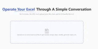
- Tell it what you need: " create a pie chart that can display Q2 sales data."

- Get a pro-quality chart in seconds, with:
- Perfectly placed labels
- Automatic color optimization
- Smart label formatting (no overlapping!)
Bonus: Excelmatic can suggest better chart types if a pie chart isn't ideal for your data.
Common Labeling Problems (And How to Fix Them)
Even with Google Sheets' best intentions, you might hit snags:
Problem: Labels disappearing
Fix: Check your data range includes headersProblem: Text overlapping
Fix: Use Excelmatic's auto-optimization or manually adjust label positionsProblem: Wrong percentages
Fix: Verify your values sum correctly (Excelmatic flags this automatically)
Pro Tips for Next-Level Pie Charts
- Limit your slices: 5-7 max (combine small categories into "Other")
- Go beyond basic labels: Add callouts for key insights
- Make it interactive: With Excelmatic, create hover effects that reveal more data
When to Upgrade from Manual to AI
Consider using Excelmatic when you:
- Work with multiple charts regularly
- Need consistent, presentation-ready visuals
- Want to save hours on data visualization
The bottom line? Adding labels manually works, but AI tools like Excelmatic turn a 10-minute task into a 10-second one - with better results.
Ready to Make Smarter Charts?
Whether you choose the manual method or let Excelmatic handle it, properly labeled charts will make your data stories clearer and more impactful. For teams that live in spreadsheets, the AI approach isn't just convenient - it's a game-changer.
Try Excelmatic free today and see how much time you can save on data visualization (while getting better at it). Your future self will thank you when that quarterly report is done in minutes, not hours.

