Data visualization is like giving your numbers a voice - but even the most beautiful charts can fall flat without clear labels. As a growth manager at Excelmatic, I've seen how proper labeling can turn confusing spreadsheets into compelling data stories. Let me walk you through how to master this in Google Sheets.
Why Chart Labels Matter
Labels are the signposts that guide your audience through your data. They answer three key questions:
- What does this axis represent?
- What exact value does this bar/show?
- What do these colors/patterns mean?
Without them, you're basically showing people a map without street names.
Getting Started: Create Your Base Chart
Before labeling, you need a chart to work with:
- Highlight your data in Google Sheets (include headers if you have them)
- Click Insert > Chart
- Choose your chart type from the sidebar (column, pie, line, etc.)
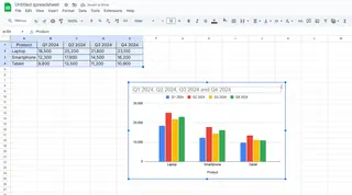
Pro tip: Excelmatic's AI can suggest the best chart type for your data automatically - no guessing needed.
Labeling Like a Pro
1. Axis Labels (The Foundation)
These tell viewers what each axis measures:
- Click your chart > Customize tab > Horizontal/Vertical axis
- Type your label (e.g., "Quarterly Revenue" or "Customer Count")
- Adjust font/size if needed
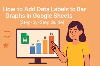
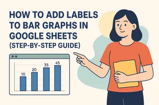
2. Data Labels (The Details)
These show exact values on each data point:
- Under Customize > Series
- Toggle "Data labels" on
- Choose position (above, below, centered)
Fun fact: Excelmatic automatically adds smart data labels that adjust based on your chart size.
3. Legends (The Key)
Essential for multi-series charts:
- Customize > Legend
- Position it (top, bottom, left, right)
- Style it to match your brand colors
Advanced Labeling Tricks
Spotlight important data:
- Right-click specific data points
- Add custom labels to highlight key metrics
Add annotations:
- Use text boxes to include extra context
- Perfect for explaining anomalies or trends
Common Labeling Mistakes to Avoid
- Overcrowding your chart (less is more)
- Using inconsistent formatting
- Forgetting mobile viewers (keep fonts readable)
- Technical jargon your audience won't understand
Why Stop at Google Sheets?
While Google Sheets gets the job done, tools like Excelmatic take visualization to the next level with:
- AI-powered label suggestions
- Automatic label positioning
- Smart formatting that adapts to your data
- One-click professional styling
The best part? You can connect Excelmatic directly to your Google Sheets data for seamless upgrades to your visualizations.
Final Thoughts
Great labels transform charts from pretty pictures into powerful communication tools. Whether you stick with Google Sheets or level up with Excelmatic, remember: your data's story is only as good as how clearly you tell it.
Ready to make your charts work harder? Try Excelmatic's AI-powered visualization tools free today - your reports will never be the same.

