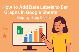
Bar graphs are the bread and butter of data visualization—they turn boring spreadsheets into snackable insights. But let’s be real: an unlabeled bar graph is like a meme without text—it just doesn’t hit the same.
If you’ve ever wasted minutes (or hours) squinting at a graph trying to match bars to numbers, this guide’s for you. Here’s how to add labels in Google Sheets so your data speaks for itself.
Step 1: Create Your Bar Graph (The Foundation)
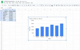
Before you can label it, you need a bar graph. Here’s the quick-and-dirty method:
- Highlight your data (e.g., monthly sales figures).
- Click Insert > Chart.
- In the Chart Editor sidebar, switch to Bar chart under Chart Type.
Pro Tip: If you’re tired of manual chart setups, tools like Excelmatic can auto-generate labeled visuals from raw data—just describe what you need in plain English.
Why Labels Matter (Spoiler: They’re Game-Changers)
Labels do the heavy lifting so your audience doesn’t have to. They:
- Show exact values on each bar (no mental math needed).
- Clarify categories for multi-series graphs.
- Make your graphs presentation-ready in seconds.
Without them, you’re basically handing your team a riddle wrapped in a spreadsheet.
Adding Labels: The 10-Second Fix
- Click your bar graph to activate the Chart Editor.
- Go to Customize > Series.
- Toggle Data Labels—boom, instant clarity.
![GIF showing the data labels toggle in Google Sheets]
Level Up: Customizing Your Labels
Default labels look… well, default. Make them pop with:
- Font size/color: Help labels stand out against colored bars.
- Position: Place labels inside, outside, or centered on bars.
- Formatting: Add % symbols or currency ($, €) directly.
Fun Fact: Excelmatic users get one-click label styling with AI suggestions—like having a designer tweak your charts automatically.
Fixing Common Label Issues
Problem: Overlapping Labels
Solutions:
- Rotate labels 45 degrees.
- Resize the graph for more breathing room.
- Use Excelmatic’s smart spacing to auto-adjust clutter.
Problem: Missing Labels
Check:
- Data range includes all values.
- No blank cells in your dataset.
Pro Moves: Annotations & Interactivity
Take it further with:
- Annotations: Right-click bars to add context like “Record month!”
- Interactive filters: Let viewers toggle data series on/off.
For next-level dashboards, Excelmatic turns static graphs into dynamic reports with drill-downs and real-time updates—no coding needed.
TL;DR Cheat Sheet
- Create bar graph: Insert > Chart > Bar.
- Add labels: Customize > Series > Data Labels ON.
- Customize: Font, color, position.
- Fix issues: Rotate/resize for overlaps.
Tired of Manual Chart Tweaking?
If labeling graphs feels like busywork, Excelmatic automates the whole process:
✅ AI-generated labels with optimal placement
✅ Brand-aligned styling templates
✅ Interactive dashboards from raw data
Spend less time formatting, more time acting on insights. Try Excelmatic free.
About the Author
As a growth lead at Excelmatic, I help teams ditch spreadsheet grunt work with AI. When I’m not geeking out over data viz, you’ll find me brewing pour-over coffee or explaining pivot tables to my dog.
Got a Google Sheets headache? Drop your question below—we’ve got answers! 🚀

