Ever looked at a chart in Google Sheets and thought, "This needs more context"? That's where error bars come in—they're like the secret sauce that makes your data visualization pop. As a growth manager at Excelmatic, I've seen how these tiny visual cues can make or break a data presentation.
Why Error Bars Matter (More Than You Think)
Error bars aren't just fancy decorations—they tell the real story behind your numbers. They show:
- How reliable your data is
- The range of possible values
- Whether differences between groups are significant
At Excelmatic, we use error bars daily when analyzing customer behavior patterns. They help us spot real trends versus random fluctuations.
Setting Up Your Data for Success
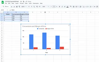
Let's say you're tracking weekly website conversions:
| Week | Conversions | Margin of Error |
|---|---|---|
| 1 | 120 | 15 |
| 2 | 135 | 10 |
| 3 | 110 | 20 |
Pro tip: Always include your error values in a separate column for easy reference.
Creating Your Base Chart (The Easy Part)
- Highlight your data range
- Click Insert > Chart
- Choose your chart type (column charts work great for this)
But here's where most people stop—don't be most people.
Adding Error Bars: The Step-by-Step Magic
Now for the good stuff:
- Click your chart to select it
- Open the Chart Editor (three dots > Edit chart)
- Go to Customize tab > Series
- Check the Error bars box
- Select "Custom" under Error bar type
- Point to your error values range
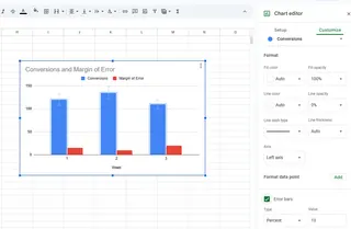
Voilà! Your chart now shows the full picture.
Common Mistakes to Avoid
- Using the wrong error type (standard deviation vs. custom values)
- Forgetting to label what your error bars represent
- Making them too thick/thin (keep them visible but not distracting)
When Manual Gets Tedious: Enter Excelmatic
While Google Sheets works for one-off charts, what if you need to:
- Automate error bars across multiple reports?
- Apply consistent styling to dozens of charts?
- Update visualizations in real-time?
That's where Excelmatic shines. Our AI-powered platform can:
- Auto-detect your error ranges
- Apply perfect error bars every time
- Keep all your charts synchronized
Imagine uploading your dataset and getting perfectly formatted charts with error bars—before you finish your coffee.
Pro Tips for Next-Level Visuals
- Color-code error bars to match your brand
- Add a brief footnote explaining your error calculation
- Use different bar styles (T-shaped, capped) for different datasets
Real-World Use Cases We Love
At Excelmatic, we've seen clients use error bars for:
- A/B test results (showing statistical significance)
- Financial forecasts (displaying confidence intervals)
- Scientific research (visualizing standard deviations)
Your Turn to Shine
Now that you've got the basics down, try adding error bars to your next presentation. And when you're ready to level up your data game, Excelmatic can handle the heavy lifting—letting you focus on insights instead of formatting.
Remember: Great data visualization isn't about fancy graphics—it's about clear communication. Error bars are your secret weapon for telling the full story behind your numbers.
Want to see how Excelmatic can automate this process for your team? Try our free demo—you'll wonder how you ever worked without it.

