Let's be real - raw numbers alone don't tell the full story. That's where error bars come in, adding crucial context to your Excel charts by showing data variability. As someone who's spent countless hours perfecting reports, I can tell you that proper error bars are what separate amateur spreadsheets from professional-grade data visualizations.
Why Error Bars Matter (More Than You Think)
Error bars aren't just fancy chart decorations - they're truth-tellers. Imagine presenting quarterly sales data without showing the range of possible values. You'd be missing the chance to highlight where your results are rock-solid versus where there's more uncertainty.
Here's the deal with different error bar types:
- Standard deviation: Shows how spread out your data points are
- Standard error: Reveals how much your average might fluctuate
- Confidence intervals: Displays the range where the true value likely falls
The Manual Method: Adding Error Bars in Excel
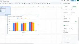
Let's walk through creating error bars manually. We'll use test scores as our example:
| Student | Exam 1 | Exam 2 | Exam 3 |
|---|---|---|---|
| Alice | 85 | 88 | 90 |
| Bob | 78 | 82 | 85 |
| Carol | 92 | 94 | 89 |
Step 1: Select your data and insert a chart (column or line charts work best)
Step 2: Click your chart > Chart Design tab > Add Chart Element > Error Bars

Pro Tip: For custom error values, choose "More Error Bar Options" and select "Custom" to specify your own ranges.
The Smarter Way: Automating Error Bars with Excelmatic
Here's where things get exciting. While manual methods work, Excelmatic's AI transforms this tedious process:
- Upload your dataset
- Describe what you need ("Show exam score variability with custom error bars")
- Watch as Excelmatic automatically:
- Identifies the appropriate error bar type
- Calculates precise values
- Generates publication-ready charts
The best part? Excelmatic maintains all the customization options while eliminating the manual work. No more hunting through menus or worrying about incorrect calculations.
Common Pitfalls (And How to Avoid Them)
Even seasoned analysts make these mistakes:
- Using default error bars when your data requires custom values
- Overcrowding charts with too many error bars
- Forgetting to label what the error bars represent
Excelmatic helps sidestep these issues with:
- Smart suggestions for optimal error bar display
- Automatic spacing and formatting
- Built-in legend generation
Beyond Basic Charts: Where Error Bars Shine
Error bars aren't just for simple bar graphs. They're incredibly useful in:
- Scientific research: Showing experimental uncertainty
- Market analysis: Displaying confidence intervals for survey data
- Financial forecasting: Visualizing projection ranges
The Bottom Line
While Excel's built-in tools get the job done, Excelmatic elevates your data storytelling by:
- Automating the technical heavy lifting
- Ensuring statistical accuracy
- Delivering presentation-ready visuals instantly
Ready to upgrade your data game? Try Excelmatic free and experience how AI can transform your error bars from afterthoughts to actionable insights. Because in today's data-driven world, it's not just about the numbers - it's about telling the full story behind them.


