Ever created a chart in Google Sheets only to realize your horizontal labels are missing or totally messed up? We've all been there. Those tiny labels make a huge difference—without them, your beautiful data visualization becomes a confusing mystery.
Good news: fixing this is easier than you think. Even better news? Tools like Excelmatic can automate this entire process (more on that later). Let’s break it down.
Why Horizontal Axis Labels Matter
Horizontal axis labels (aka category labels) are the GPS for your data. They tell viewers:
- What they’re looking at (e.g., "Sales Q1" vs. "Temperature")
- How to interpret trends (e.g., months, product categories)
Without them, you’re basically asking people to read your mind. Not cool.
Prep Your Data Like a Pro
Before creating charts, organize your data so Google Sheets doesn’t get confused:
- Column setup: Put categories (e.g., months, products) in one column.
- Headers matter: Label columns clearly (e.g., "Month" and "Revenue").
- No blank cells: Gaps = chart chaos.
Pro Tip: If you’re using Excelmatic, just upload your messy data—it auto-cleans and suggests the best chart types.
Creating Your Chart (The Easy Way)
- Select your data (click + drag).
- Click Insert > Chart.
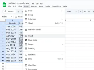
- Pick a chart type (Google Sheets suggests one, but you can change it).
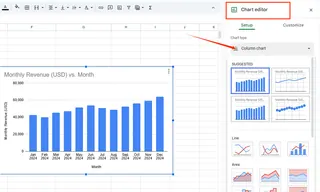
Boom—chart appears! But if the labels look wonky, don’t panic.
Fixing Missing or Weird Labels
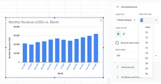
- Double-click the chart to open the Chart Editor.
- Go to Customize > Horizontal Axis.
- Adjust:
- Text: Font, size, color
- Angle: Tilt labels if they overlap
- Source data: Ensure the correct column is selected under Setup > X-axis
Fun Fact: Excelmatic lets you customize labels with AI—just type what you want (e.g., "Make labels bold and blue") and it handles the rest.
Common Problems (And Quick Fixes)
- Labels missing? Check your data range includes the label column.
- Wrong labels? Reassign the correct column to the X-axis.
- Overlapping text? Rotate labels or increase chart width.
Level-Up Your Charts
Once labels are set, try these pro moves:
- Trendlines: Highlight patterns (great for time-based data).
- Dynamic ranges: Charts auto-update when new data is added.
- Annotations: Call out key points (e.g., "Peak sales in December").
The Future of Charts? Let AI Do It
Manually tweaking charts works, but tools like Excelmatic change the game:
- Auto-generate charts from raw data
- AI-powered customization (e.g., "Make a minimalist bar chart with pink labels")
- One-click sharing for presentations/reports
Why waste time on manual formatting when AI can do it in seconds?
Final Thoughts
Clear axis labels turn data into stories. Whether you use Google Sheets’ basic tools or Excelmatic’s AI magic, the goal is the same: make your data impossible to misunderstand.
P.S. Hate spreadsheet busywork? Excelmatic automates charts, dashboards, and reports—so you can focus on insights, not formatting.

