Let's be real - error bars in Excel can feel like trying to solve a Rubik's cube blindfolded. Those little T-shaped lines that show data variability often leave even experienced users scratching their heads. But here's the good news: AI is changing the game completely.
At Excelmatic, we've seen how AI transforms tedious spreadsheet tasks into one-click solutions. Error bars are no exception. What used to take 10 manual steps now happens instantly with smart tools that understand your data better than you do.
Why Error Bars Matter (And Why AI Makes Them Better)
Error bars aren't just fancy chart decorations. They're your data's truth-tellers, showing:
- How reliable your measurements are
- The range of possible values
- Whether differences between groups are meaningful
The problem? Choosing the right type (standard deviation? confidence intervals?) and calculating them manually is where most people get stuck. That's where Excelmatic shines - our AI analyzes your dataset and recommends the perfect error bars automatically.
The Smart Way to Add Error Bars: Excelmatic's AI Approach
Here's how modern professionals are handling error bars:
- Upload your data to Excelmatic (we connect directly to your Excel files)
- Describe what you need ("show variability in our Q2 sales data")
- Watch the magic happen - our AI suggests and applies the optimal error bars
Compared to the old-school Excel method (which we'll cover next), this approach saves about 90% of the time while reducing calculation errors to near zero.
The Traditional Method (For Comparison)
For those who want to understand the manual process:
- Select your chart in Excel
- Click "Add Chart Element" > "Error Bars"
- Choose from standard options like:
- Standard deviation
- Standard error
- Percentage
- Custom values
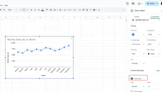
The catch? You need to know which type fits your data. Get it wrong, and your visualization could mislead rather than inform.
Error Bars Gotchas (And How AI Avoids Them)
We've identified three common pitfalls:
- Misinterpretation: Using standard deviation when you need confidence intervals
- Inconsistency: Different error bar types across similar charts
- Overcomplication: Adding too many statistical layers
Excelmatic's AI prevents these by:
- Analyzing your data distribution first
- Maintaining consistency across all visuals
- Keeping visualizations clean and readable
Why Excelmatic Beats Other AI Tools
While several tools claim to help with Excel charts, Excelmatic stands out because:
✅ True AI Understanding: Doesn't just follow rules - interprets your data's story
✅ Two-Way Excel Integration: Works seamlessly within your existing spreadsheets
✅ Explanations Included: Shows why it chose specific error bars
✅ One-Click Adjustments: Change error bar types with a single click
The Future Is Already Here
Remember when adding error bars meant consulting statistics textbooks? Those days are gone. With Excelmatic:
- Your charts automatically update when data changes
- You get plain-English explanations of the statistics
- Team members can understand visuals without data science degrees
Ready to Ditch the Spreadsheet Struggle?
Adding error bars shouldn't require a PhD in statistics. With Excelmatic, you get:
- Professional-grade data visualization
- Time savings (about 2 hours per complex chart)
- Confidence that your visuals tell the true story
The best part? You can try it free today and see the difference AI makes. Your future self (and your team) will thank you when reports that used to take days now take minutes.

