Ever stared at an Excel chart and felt like something was missing? That "something" might be error bars – those tiny but mighty visual cues that show how much your data points vary. Whether you're presenting quarterly sales figures or scientific research results, error bars add credibility and depth to your charts.
At Excelmatic, we know data visualization can make or break your reports. That's why we're sharing this simple guide to mastering error bars in Excel. Let's dive in!
Why Error Bars Matter in Data Visualization
Error bars are like the "fine print" of your charts – they show the margin of error or variability in your data. Imagine presenting average customer satisfaction scores without showing how much those scores fluctuate. Your audience might assume the numbers are set in stone when they're actually more nuanced.
Here's where error bars shine:
- They reveal data reliability at a glance
- They add professional polish to your reports
- They help prevent misinterpretation of your findings
Understanding Different Types of Error Bars
Excel offers several error bar options, each serving different purposes:
- Standard Error: Shows how much each point deviates from the mean (great for general data presentations)
- Percentage: Displays relative changes (perfect for financial data)
- Fixed Value: Uses a consistent numerical value (helpful for showing uniform uncertainty)
- Custom: Lets you input specific values (maximum flexibility)
Pro tip: Excelmatic's AI-powered analysis can automatically recommend the best error bar type for your specific dataset, saving you the guesswork.
How to Add Error Bars in Excel: The Simple Way
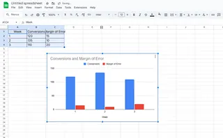
Ready to upgrade your charts? Here's how to add error bars in just a few clicks:
- Select your chart in Excel
- Click the "+" button that appears near the chart's edge
- Check the "Error Bars" box
- Choose your preferred error bar type


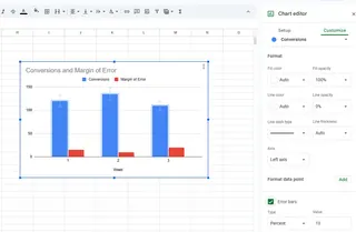
For more customization:
- Right-click any error bar
- Select "Format Error Bars"
- Adjust color, thickness, and style to match your chart
Common Mistakes to Avoid
Even simple error bars can go wrong. Watch out for these pitfalls:
- Overcrowding: Too many error bars can make charts messy
- Inconsistent scaling: Ensure all error bars use the same measurement
- Missing labels: Always explain what your error bars represent
When to Use Error Bars (And When to Skip Them)
Error bars work best for:
- Scientific data showing experimental variability
- Financial forecasts with uncertainty ranges
- Survey results with confidence intervals
They might be unnecessary for:
- Simple internal reports where precision isn't critical
- Charts with obvious, self-explanatory patterns
- Presentations to non-technical audiences
Take Your Charts Further with Excelmatic
While Excel's built-in tools work, Excelmatic takes data visualization to the next level. Our AI-powered platform can:
- Automatically add and style error bars based on your data
- Generate professional reports with one click
- Suggest optimal visualization formats for your specific dataset
Why spend hours tweaking charts when AI can do it in seconds? Try Excelmatic today and transform how you present data.
Final Thoughts
Error bars might seem like a small detail, but they make a big difference in how your data is perceived. By following this guide, you're well on your way to creating more accurate, professional-looking charts.
Remember: Good data visualization isn't just about showing numbers – it's about telling their full story. And with tools like Excelmatic, that story has never been easier to tell.


