Let's be real - we've all been there. You've spent hours crafting the perfect Excel graph for your quarterly report, only for your boss to ask, "Can we add last month's numbers?" Before you panic about ruining your beautiful chart, take a deep breath. Adding data to existing Excel graphs is way easier than you think.
At Excelmatic, we help teams transform their spreadsheet game every day. Here's our foolproof method for updating your charts without the headache.
Understanding Your Current Chart Setup
First things first - know what you're working with. Is it a simple bar chart tracking monthly sales? A line graph showing website traffic trends? The type of chart determines how you'll add new data.
Take 30 seconds to analyze:
- What story is your current chart telling?
- What time periods or categories does it cover?
- Are there any special formatting elements (like dual axes)?
This quick audit will save you from creating a messy, confusing chart later.
Selecting the Right Data to Add
Here's where many people stumble. You don't want to just dump numbers into your chart - they need to make sense contextually.
Pro tip: Before adding anything, ask yourself:
- Does this new data use the same scale/units?
- Will it complement or clutter the existing visualization?
- Does it need to be on a secondary axis?
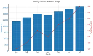
For example, if you're tracking monthly revenue, adding profit margin percentages might require a second Y-axis to keep things readable.

The Step-by-Step Process (No Tech Skills Needed)
- Click your chart to activate it (you'll see a border appear)
- Right-click and select "Select Data" (or find this in the Chart Tools menu)
- In the dialog box, click "Add" under Legend Entries
- Either:
- Type your new series name and values manually
- Click the range selector icon to highlight cells in your sheet
- Hit OK twice to confirm
Boom - your chart now includes the fresh data! But we're not done yet...
Formatting for Maximum Impact
New data means new formatting considerations. Here's how to keep things clean:
- Color code wisely: Excel auto-assigns colors, but make sure they're distinct from existing data
- Adjust axes if needed (right-click axis > Format Axis)
- Add clear labels so viewers instantly understand the new elements
Remember: The goal is clarity, not artistic expression. When in doubt, keep it simple.
Common Pitfalls (And How to Avoid Them)
After helping thousands of users at Excelmatic, we've seen it all:
🚫 Mismatched data ranges: Always double-check your new data aligns with existing scales
🚫 Chart clutter: More data ≠ better insights. Be ruthless about what truly needs to be shown
🚫 Over-designing: Fancy effects often distract from the data story
Level Up with Excelmatic's AI Assistant
Here's a game-changer - what if you could update charts without all these manual steps? With Excelmatic's AI-powered spreadsheet assistant:
✅ Describe what data to add in plain English
✅ Get automatic formatting recommendations
✅ Create dynamic charts that update as new data comes in
ex:
No more digging through menus or worrying about broken formulas. Our users report saving 5+ hours weekly on reporting tasks alone.
Advanced Techniques Worth Trying
Once you've mastered the basics, consider:
📊 Dynamic named ranges: Make your charts auto-update when new data is added
📊 Combination charts: Mix chart types (like columns + lines) for richer insights
📊 Interactive elements: Add filters or slicers for viewer customization
Final Thoughts
Updating Excel charts doesn't need to be stressful. With this methodical approach, you can confidently add new data while keeping your visuals clean and professional.
And if you're tired of manual chart updates? That's exactly why we built Excelmatic. Our AI assistant handles the tedious parts, so you can focus on insights, not formatting. Try it free today and see the difference for yourself.


