Let's be real - nothing kills the momentum of a business meeting faster than fumbling with spreadsheet charts. You've got fresh sales numbers to show, but your chart looks stuck in last quarter. Been there, done that.
The good news? Updating charts in Google Sheets doesn't have to be painful. As someone who's built hundreds of data visualizations for growth teams, I'll walk you through the simplest methods - plus share how AI tools like Excelmatic can automate this entire process.
Why Charts Matter (Especially When They're Current)
Charts turn spreadsheet chaos into clear stories. A well-updated chart can:
- Spot sales trends before your competitors do
- Show campaign performance at a glance
- Make quarterly reports actually readable
But here's the catch: stale data visualizations are worse than no visualizations at all. That's why knowing how to efficiently add new data points is crucial.
The Manual Method: Step-by-Step
For those times when you need to quickly update a chart yourself:
Select your new data range
Click and drag to highlight both existing and new data. Pro tip: Keep your data structure consistent (dates in column A, values in B, etc.)Update the chart source
Click your chart > Chart Editor (three dots) > Data range > Adjust the range to include new cellsUse Series for complex adds
In Chart Editor's Setup tab, click "Add series" to include additional metrics without changing your main rangeTry named ranges for recurring updates
Create them via Data > Named ranges. Then reference these names in your chart for automatic updates
While these steps work, they get tedious fast - especially when you're managing multiple dashboards. Which brings me to...
The Smart Alternative: Let AI Handle It
Here's where tools like Excelmatic change the game. Instead of manually adjusting ranges:
- Connect your Google Sheet
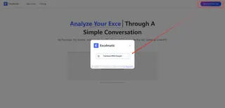
- Tell it what to visualize ("Show monthly sales growth")

- Watch as it builds and auto-updates charts
The magic? Excelmatic understands your data structure and relationships. Add new rows? It intelligently incorporates them into existing visualizations. No range adjustments needed.
Pro Tips for Business Users
Watch your formatting
Mixed date formats or number types will break your charts faster than you can say "pivot table"Less is more
Cramming 12 metrics into one chart helps no one. Ask: "What's the one insight I need to show?"Make it audience-ready
Add clear labels and choose colors that work in presentations (no neon greens on projectors)
When to Upgrade from Manual Charts
If you find yourself:
- Spending more time updating charts than analyzing them
- Missing insights because visualization feels like a chore
- Needing to share live dashboards with stakeholders
...it's time to try AI-powered solutions. Excelmatic users report saving 5+ hours weekly on routine data visualization tasks - time better spent on strategic decisions.
The Bottom Line
Updating Google Sheets charts doesn't have to be a time sink. While the manual method works for one-off updates, modern teams are switching to AI tools that handle the grunt work automatically.
Want to see the difference? Try Excelmatic's free plan and watch your charts update themselves as new data comes in. Your future self (and your colleagues) will thank you.

