Ever looked at a Google Sheets chart and thought, "This would be so much clearer with labels"? You're absolutely right. Data labels transform messy charts into crystal-clear visual stories. But here's the game-changer: AI can do this for you automatically.
At Excelmatic, we've seen how AI revolutionizes data visualization. What used to take hours of manual tweaking now happens in seconds. Let me show you how to upgrade your Google Sheets workflow with smart data labeling.
Why Data Labels Matter (And Why AI Makes Them Better)
Picture this: You've got a sales chart showing monthly performance. Without labels, your team is squinting at bar heights trying to guess the numbers. Data labels put the exact figures right where they belong - on the chart itself.
The old-school way works, but it's tedious:
- Click your chart
- Open the chart editor
- Navigate to Customize tab
- Check the "Data labels" box
Simple? Yes. Efficient for multiple charts? Not really. That's where AI tools like Excelmatic change everything.
The AI Advantage: Smarter Labels in Seconds
Excelmatic's AI understands your data like a human analyst would. It doesn't just slap numbers on charts - it:
- Automatically positions labels for maximum clarity
- Adjusts formatting based on your data type
- Updates instantly when your data changes
- Even suggests which data points need special emphasis
Here's how it works in practice:
- Connect Excelmatic to your Google Sheets
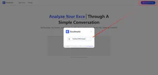
- Select your data range
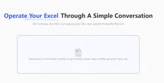
- Tell her your needs in natural language.

- Watch as perfectly placed labels appear instantly
Pro tip: Excelmatic's AI learns from your preferences. The more you use it, the better it gets at anticipating how you want your charts labeled.
Pro Labeling Tips (With or Without AI)
Whether you're using AI or going manual, these rules make your charts shine:
- Less is more: Only label key data points that tell your story
- Consistency wins: Use the same font and color scheme across all charts
- White space matters: Ensure labels don't overlap or clutter the view
- Context helps: Add units ($, %, etc.) directly in labels when possible
Excelmatic's AI automatically applies these best practices, but they're good to know if you need to make manual tweaks.
Beyond Basic Labels: What AI Can Really Do
Modern AI tools don't stop at simple number labels. Excelmatic can:
- Highlight trends with color-coded labels
- Flag anomalies with special markers
- Add smart callouts to important data points
- Even generate mini-analyses that appear when viewers hover over labels
For teams presenting data regularly, these features are game-changers. No more last-minute formatting scrambles before meetings.
Getting Started With AI-Powered Data Labels
Ready to try AI labeling? Here's your quick start guide:
- Install Excelmatic's Google Sheets add-on (it's free to start)
- Upload any chart-containing spreadsheet
- Tell her your needs in natural language.
- Waiting for your result.
The best part? Excelmatic works with all chart types - from simple bar graphs to complex scatter plots. And if you need to adjust anything, manual overrides take just one click.
ex:(scatter plot)
Why We Built This Feature at Excelmatic
As growth managers, we live in spreadsheets. We built Excelmatic because we got tired of:
- Wasting hours on repetitive formatting
- Missing opportunities in our data
- Creating charts that didn't communicate effectively
Now, our entire team uses AI labeling daily. It's saved us hundreds of hours while making our reports 10x more impactful. And we're just getting started - new AI chart features roll out every month.
Your Turn to Upgrade
Data labels might seem like a small thing, but they make a huge difference in how your work gets understood. With AI tools like Excelmatic, you get professional-quality visuals without the manual labor.
Try it today - your future self (and your colleagues) will thank you when presentation time comes around. Because in business, clarity isn't just nice to have - it's what separates good decisions from great ones.
P.S. Want to see AI labeling in action? Check out our free interactive demo at https://excelmatic.ai - no signup required.

