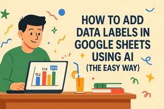
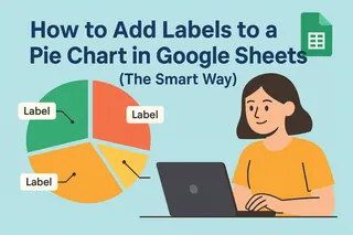
We’ve all been there—staring at a chart trying to guess what those tiny bars or dots actually mean. Data labels are the secret sauce that makes your charts instantly understandable. Let me show you how to add them in Google Sheets, with bonus pro tips to save you hours of manual work.
Why Data Labels Matter
Imagine presenting monthly sales data to your team. Without labels, they’re squinting at axis values. With labels? They see "$42K" right on the bar and instantly know Q3 crushed it. That’s the power of labels—they turn charts from pretty pictures into actionable insights.
Pro Tip: Tools like Excelmatic can auto-generate labeled charts from raw data in seconds, but we’ll cover the manual process first so you understand the fundamentals.
Step 1: Create Your Chart (The 30-Second Version)
- Dump your data into Sheets (e.g., Column A = months, Column B = sales).
- Highlight the data and click Insert > Chart.
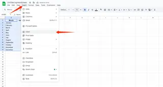
- Pick your chart type (bar, line, pie—whatever tells your story best).
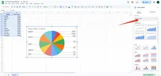 Already have a chart? Skip to the good stuff below.
Adding Labels: The Magic Checkbox
Here’s where the clarity happens:
- Click your chart to select it.
- Open the Chart Editor sidebar (if it’s not there, double-click the chart).
- Go to Customize > Series.
- Toggle Data Labels ON.
Boom—numbers or text now appear directly on your data points. No more mental math!
Level Up: Customization Hacks
Google Sheets lets you tweak labels like a pro:
- Font/style: Make labels bold or larger so they pop.
- Position: Place labels inside bars, above lines, or wherever they’re least annoying.
- Formatting: Add dollar signs, percentages, or decimal places.
Time-Saver: Excelmatic’s AI suggests optimal label placements based on your data type—no trial and error.
Advanced Moves (For Overachievers)
- Conditional Labels: Use separate data columns to highlight specific values (e.g., red labels for underperforming months).
- Dynamic Updates: Link labels to formulas so they auto-update when data changes.
Common Mistakes to Avoid
- Label overload: Only tag key data points to prevent clutter.
- Inconsistent formatting: Keep fonts/colors uniform unless you’re highlighting something special.
- Ignoring mobile viewers: Test if labels are readable on small screens.
When to Use AI Instead
While manual labeling works for one-off charts, tools like Excelmatic are game-changers for:
- Dashboards that update in real time
- Teams where non-tech folks need polished reports
- You when you’d rather analyze data than design charts
(Seriously—try pasting your data into Excelmatic and saying “show sales trends with labels.” Watch the magic happen.)
Final Thought
Data labels are like subtitles for your charts—they make sure everyone gets the story. Now that you’ve mastered the basics, imagine what you could do with AI handling the busywork.
Your Move: Open that report you’ve been avoiding, slap some labels on it, and watch your colleagues nod in understanding. Or better yet, let Excelmatic do it while you grab coffee.

