Let’s be real—staring at endless rows of numbers in Google Sheets can make anyone’s eyes glaze over. But what if you could make your data pop with simple visual cues? That’s where arrows come in.
As a growth manager at Excelmatic, I’ve seen how arrows can turn dry spreadsheets into dynamic dashboards. They’re perfect for:
- Highlighting key metrics (📈 sales up? 📉 costs down?)
- Creating easy-to-follow flowcharts
- Guiding users through complex data
Here are 5 foolproof ways to add arrows in Google Sheets—no design degree required.
Method 1: The Quick Fix (Unicode Arrows)
Need an arrow right now? Unicode symbols are your best friend:
- Double-click any cell
- Press
Ctrl+/(Windows) orCmd+/(Mac) - Search "arrow" → pick your favorite
Pro Tip: Copy-paste these for instant use:
→ Right arrow (→)
↑ Up arrow (↑)
🔽 Down triangle (🔽)
Best for: Quick indicators in text-heavy sheets
Method 2: Custom Arrows with Google Drawings
Want arrows that match your brand colors? Google Drawings has you covered:
- Click Insert → Drawing
- Use the Line tool → select an arrow style

- Customize thickness/color like a pro
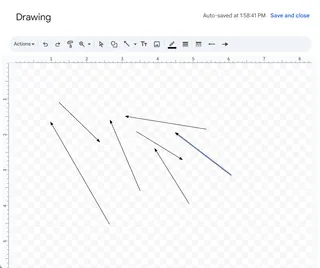
Why it rocks: Perfect for presentations where visuals matter
Method 3: Auto-Updating Arrows (Conditional Formatting)
Tired of manually updating arrows? Let Google Sheets do the work:
- Select your data range
- Go to Format → Conditional formatting
- Set rules like:
=A1>B1→ Green up arrow=A1<B1→ Red down arrow
Real-world use: Monthly sales reports that update themselves
Method 4: Drag-and-Drop Arrow Images
Need something more stylish?
- Download arrow icons from Flaticon
- Click Insert → Image → Upload
- Resize over your data
Designer hack: Use PNGs with transparent backgrounds
Method 5: Next-Level Automation with Excelmatic
Here’s where things get exciting. While Google Sheets has basic tools, Excelmatic takes visual data storytelling to the next level with:
✅ Smart auto-formatting that adds context-aware arrows
✅ AI-powered charts that suggest optimal visual cues
✅ One-click templates for flowcharts and dashboards
Why teams love it: No more wasting hours manually adding arrows—our AI handles the busywork while you focus on insights.
Pro Tips for Arrow Mastery
- Less is more – Use arrows sparingly to avoid "visual noise"
- Color code – Green = good, Red = needs attention
- Combine methods – Use Unicode for text, Drawings for diagrams
Ready to Upgrade Your Data Game?
Arrows are just the beginning. With tools like Excelmatic, you can:
✨ Automate repetitive formatting
✨ Generate AI-powered insights
✨ Build stunning dashboards in minutes
Try Excelmatic free today and turn your spreadsheets into data stories that actually get noticed.
About the author:
As Excelmatic’s Growth Manager, I help teams ditch spreadsheet frustration. When not geeking out over data viz, you’ll find me brewing pour-over coffee or explaining pivot tables to my cat. 🐱📊


