Google Sheets is a go-to for quick data visualization, but when you need to compare multiple metrics on one graph, things can get tricky. As a user growth manager at Excelmatic, I've seen how frustrating it can be when your charts don't show the full picture. Let me walk you through the simple process of adding additional lines to your graphs—it's easier than you think!
Creating Your First Line Graph
Before adding extra lines, you'll need a base graph. Here's the quick-start guide:
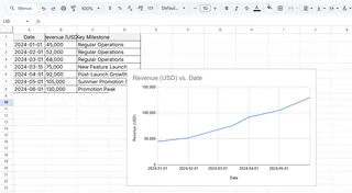
- Open your Google Sheet with the data (or enter sample data like "Month" and "Sales" columns)
- Highlight your data range
- Click Insert > Chart from the top menu
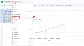
- In the Chart Editor sidebar, select "Line chart" if not already chosen
Pro tip: Excelmatic can automate this process—just upload your data and describe what you need, and it generates polished charts instantly.
Adding Your Second Data Line
Now for the magic—comparing two metrics side-by-side:
- Ensure your additional data is in the same sheet (e.g., "Projected Sales" in column C)
- Click your existing graph to activate the Chart Editor
- Under Setup tab, click "Add series"
- Select your new data range (e.g., C1:C12)
- Watch your second line appear!
Excelmatic simplifies this further by automatically detecting related data series and suggesting optimal visualizations.
Making Your Graph Crystal Clear
Multiple lines can become messy without proper formatting:
- Color Coding: In the Customize tab, assign distinct colors to each series
- Data Labels: Turn on labels for key data points
- Line Thickness: Emphasize important trends with thicker lines
- Legend: Ensure your graph key is visible and descriptive
With Excelmatic, these styling choices are handled automatically based on best practices for data visualization.
Advanced Pro Tips
For more sophisticated analysis:
- Secondary Axis: Use when comparing different scales (e.g., revenue vs percentage growth)
- Trendlines: Highlight patterns by adding linear/exponential trend projections
- Dynamic Ranges: Use formulas like =A1:B to auto-include new data
Why Stop at Google Sheets?
While Google Sheets gets the job done, tools like Excelmatic take visualization to the next level by:
- Automatically suggesting the most effective chart types
- Generating interactive dashboards from raw data
- Applying AI-powered insights to highlight key trends
- Updating visuals in real-time as data changes
Next time you're preparing a business report or performance dashboard, try adding multiple lines to tell a richer data story. And if you're tired of manual chart tweaking, Excelmatic can transform your workflow—because your time is better spent analyzing insights than building graphs!
Remember: Great data visualization isn't about fancy graphics—it's about making complex information instantly understandable. Whether you use Google Sheets or advanced tools like Excelmatic, the goal remains the same: turn numbers into actionable business intelligence.

