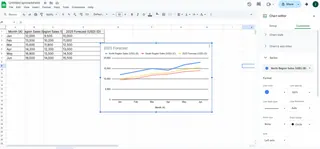
Excel charts transform boring spreadsheets into visual stories. But what happens when you need to compare sales across regions or track multiple KPIs? That's where adding another data series comes in clutch.
While Excel gets the job done, tools like Excelmatic (our AI-powered spreadsheet assistant) can automate this process while suggesting the best chart types for your data. But let's start with the manual method every analyst should know.
Why Multiple Data Series Matter
A data series is just a fancy term for your plotted metrics. Think monthly sales figures or quarterly website traffic. Single-series charts are fine, but the real magic happens when you layer multiple series:
- Compare product performance side-by-side
- Track actual vs. forecasted results
- Visualize correlations between metrics
Prepping Your Data Like a Pro
Before diving in, organize your data properly:
- Keep consistent formatting (rows as months, columns as products)
- Use clear headers like "Q1 Sales - Region A"
- Place new data adjacent to existing series
Pro tip: Excelmatic can automatically detect and standardize your data structure - saving you this prep work.
The 5-Minute Guide to Adding Series
Here's how to level up your chart game:
- Click your existing chart to activate Chart Tools
- Navigate to Design > Select Data
- Click "Add" in the legend entries section
- Name your series (e.g., "2025 Forecast")
- Select the data range or let Excelmatic suggest relevant ranges
- Click OK twice to apply

Boom! Your chart now shows multiple metrics. But we're just getting started.
Making It Actually Useful
New data can make charts messy. Fix this with:
- Right-click any series to change its chart type (try combining bars and lines)
- Double-click elements to customize colors and labels
- Add a secondary axis when values have different scales (right-click series > Format Data Series > Secondary Axis)
When Manual Editing Gets Old
If you're constantly updating charts, consider:
- Converting ranges to Tables (they auto-expand with new data)
- Using Excelmatic's AI to:
- Auto-detect when to add new series
- Suggest optimal chart formats
- Generate dynamic dashboards that update as your data changes
Real-World Uses That Actually Matter
Multiple series aren't just pretty - they solve problems:
- Marketing: Compare campaign performance across channels
- Finance: Visualize revenue vs. expenses over time
- Operations: Track inventory levels vs. sales velocity
The Smarter Alternative
While Excel's manual method works, modern teams use tools like Excelmatic to:
- Automatically detect when to add series
- Recommend the most effective visualizations
- Generate shareable dashboards in clicks
- Provide AI-powered insights about your multi-series trends
Why waste time manually updating charts when AI can do it better and faster?
Your Next Steps
Try adding a second series to your next report. For teams doing this regularly, Excelmatic offers a free trial to experience AI-powered chart automation. Because your time is better spent analyzing data than wrestling with formatting.
Remember: Great data storytelling needs multiple perspectives. Whether you do it manually or with AI assistance, layered charts reveal insights single-series views can't.


