Let's be real - staring at raw Excel data can feel like trying to read hieroglyphics. But when you visualize that data with graphs and equations? Suddenly everything clicks. As a growth manager at Excelmatic, I've seen how adding equations to graphs can turn confusing spreadsheets into powerful decision-making tools.
Why Bother With Graph Equations?
Before we dive into the how-to, let's talk about why this matters:
- Spot trends instantly: That squiggly line between your data points? Its equation tells you exactly what's happening in your business metrics.
- Predict like a fortune teller: Use the equation to forecast future numbers with scary accuracy.
- Impress your boss: Nothing says "data pro" like a graph that explains itself.
At Excelmatic, we've built AI tools that automate this whole process, but understanding the manual method makes you a spreadsheet wizard.
Getting Your Data Ready
You wouldn't bake a cake with lumpy flour - same goes for graphs. Here's how to prep your data:
- Clean it up: No blank cells allowed. Excel hates those.
- Organize smartly: Put your X values in one column, Y values in another.
- Check your work: Make sure numbers are actually numbers (not text pretending to be numbers).
Pro tip: Excelmatic's AI can clean and organize messy data in seconds if you're short on time.
Creating Your Base Graph
Time to make some visual magic happen:
- Highlight your clean data
- Click Insert > Charts
- Choose Scatter or Line chart (these work best for equations)

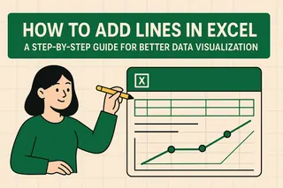
Boom - instant visualization. But we're just getting started.
Adding the Equation (The Good Part)
Here's where the real insights begin:
- Right-click any data point
- Select "Add Trendline"
- In the sidebar that pops up:
- Pick your trend type (linear works for most business data)
- Check "Display Equation on chart"
Like adding captions to a meme, the equation suddenly makes everything make sense.
Making It Pretty (Because Looks Matter)
Now let's polish that graph:
- Move the equation: Drag it somewhere visible but not obnoxious
- Color code: Match your trendline to your brand colors
- Font tweaks: Make sure grandma could read it from across the room
At Excelmatic, we automate these design choices, but knowing how to do it manually gives you more control.
Using Your Equation for Real Business Wins
That equation isn't just decoration - it's a superpower:
- Predict sales: Plug in future dates to forecast revenue
- Spot problems: A suddenly flattening trendline? Time to investigate
- Prove your point: Hard numbers beat vague hunches every time
When Things Go Wrong (And How to Fix Them)
Ran into trouble? Here's your emergency kit:
- Equation invisible? Double-check that display box is ticked
- Weird trendline? Try a different type (exponential, polynomial, etc.)
- Numbers look off? Recheck your original data
Remember: Excelmatic's AI catches these issues automatically, saving you the headache.
Level Up: Advanced Equation Tricks
For the data nerds (we see you):
- Add multiple trendlines to compare different products/periods
- Use the equation in other formulas for next-level analysis
- Combine with Excel's FORECAST function for even better predictions
Why Stop at Manual? Let AI Do the Heavy Lifting
While mastering these Excel skills is valuable, tools like Excelmatic transform this whole process:
- Automatically suggests the best trendlines
- Generates polished, presentation-ready graphs
- Updates equations in real-time as data changes
The result? You spend less time formatting and more time making strategic decisions.
Final Thoughts
Adding equations to Excel graphs turns good data into great insights. Whether you do it manually or with AI assistance, this skill separates data workers from data leaders.
Want to try the smarter way? Excelmatic can help you create equation-powered graphs in seconds - no advanced Excel skills required. Because in today's fast-moving business world, time saved is money earned.


