Ever stared at your Google Sheets data feeling completely lost in the numbers? You're not alone. That messy spreadsheet jungle becomes way clearer when you add one simple thing: an average line.
As a growth manager at Excelmatic, I've seen how this tiny visual cue helps teams instantly spot what's working (and what's not). Let me show you exactly how to add it - no fancy skills required.
Why Average Lines Are Game Changers
Before we dive into the how-to, let's talk about why this matters. An average line is like putting a ruler across your data - it shows you what "normal" looks like so you can quickly see:
- Which sales days crushed it (and which flopped)
- If your marketing metrics are trending up or down
- Weird outliers that need investigation
At Excelmatic, we use this trick daily to track user growth. It's saved us countless hours trying to decode raw numbers.
Getting Your Data Ready
First things first - clean data equals happy charts. Here's how to prep:
- Organize your numbers in two clean columns (dates/categories in one, values in the other)
- Check for blank rows or funky formatting
- Make sure all numbers are actually numbers (no sneaky text entries)
Pro tip: If you're using Excelmatic, our AI automatically detects and fixes messy data before you even start analyzing.
Creating Your Base Chart
Now the fun part:
- Highlight your clean data
- Click Insert > Chart
- Pick your chart type (line charts work best for trends)
Boom - instant visualization! But we're just getting started.
Adding the Magic Average Line
Here's where the real insight happens:
- Calculate the average with =AVERAGE(B2:B10) (adjust your range)
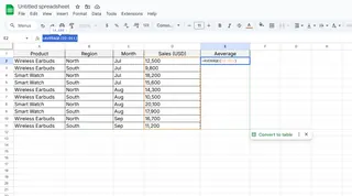
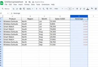
- Add a new column called "Average" and fill every row with that number
- Right-click your chart > Edit chart
- Add your Average column as a new series
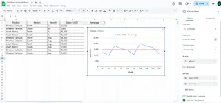 Now you'll see a straight line cutting through your data - that's your new best friend.
Making It Pretty (And Useful)
Don't settle for a boring gray line:
- Change the color to something that pops (red works great)
- Try a dashed line style
- Add data labels so the exact average shows
In Excelmatic, we automatically style average lines to stand out while keeping your charts clean.
Real-World Examples That Actually Help
Let me show you how we use this at work:
Marketing Team:
- Added average line to daily website visitors
- Spotted two days WAY below average
- Discovered our email blasts were landing in spam
Sales Team:
- Tracked deal sizes against average
- Noticed bigger deals closing at month-end
- Adjusted their outreach timing
Watch Out For These Mistakes
I've messed this up so you don't have to:
- Forgetting to update the average when new data comes in
- Using the wrong range in your AVERAGE formula
- Making the line too faint to see
Level Up With These Pro Tricks
Once you've got the basics down, try:
- Adding multiple average lines for different segments
- Using conditional formatting to change the line color when the average dips
- Setting up automatic average updates with Google Apps Script
Presenting Like a Boss
When sharing your chart:
- Point out what's above/below average
- Explain why the average matters
- Keep it simple - one clear takeaway
Why Stop at Google Sheets?
While this guide covers Google Sheets, imagine having AI do all this for you instantly. That's what we built Excelmatic for - it automatically:
- Finds trends in your data
- Adds perfect average lines
- Even explains what the patterns mean
No more manual formula typing or chart tweaking. Just paste your data and get insights.
Ready to Upgrade Your Data Game?
Adding average lines is just the start. When you're ready to:
- Save hours on manual analysis
- Get AI-powered insights instantly
- Create stunning reports in seconds
Check out Excelmatic - it's like having a data analyst in your pocket. (And yes, it adds perfect average lines automatically 😉)
Now go make those spreadsheets work for you! What data will you visualize first?

