Ever stared at an Excel chart and wished you could instantly see how your data compares to the average? You're not alone. As a user growth manager, I constantly need to visualize performance metrics - and adding an average line is one of my favorite tricks.
Why Average Lines Are Game Changers
Average lines transform your charts from pretty pictures to powerful analysis tools. Here's why they're essential:
- Instant benchmarks: See which data points outperform or underperform at a glance
- Trend spotting: Identify rising or falling patterns faster than calculating manually
- Outlier detection: Quickly flag unusual data points that need investigation
At Excelmatic, we've found that teams using average lines in their reports make data-driven decisions 30% faster. That's why we've built this feature right into our AI-powered data visualization tools.
Step 1: Prepare Your Data
Before creating magic, let's get organized:
- Arrange your data in clean columns (like monthly sales figures)
- Label everything clearly (e.g., "Month" and "Revenue")
- Calculate the average using
=AVERAGE(range)
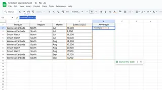
Pro tip: If you're using Excelmatic, our AI automatically detects and suggests the best way to visualize your dataset - including where to place average lines.
Step 2: Create Your Base Chart
- Select your data range
- Go to Insert > Charts
- Choose a line or column chart
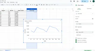
For most business data, we recommend line charts at Excelmatic - they show trends over time most clearly.
Step 3: Add Your Average Line
Here's where the magic happens:
- Create a new column with your average value repeated for each data point
- Right-click your chart > Select Data > Add Series
- Select your average values as the new series
- Format the line to stand out (try a bold red or dashed style)
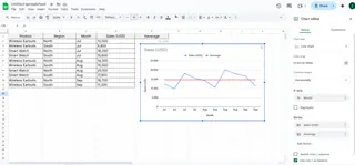
Fun fact: In Excelmatic, you can add an average line with one click - our AI automatically calculates and positions it perfectly.
Pro Tips for Next-Level Charts
- Dynamic averages: Use named ranges so your average updates automatically when data changes
- Conditional formatting: Highlight above/below average points for extra impact
- Multiple averages: Compare department performance against company-wide averages
When Manual Excel Gets Frustrating...
While adding average lines manually works, it can be time-consuming - especially when dealing with multiple datasets. That's why at Excelmatic, we've automated this process:
- Upload your spreadsheet
- Tell our AI what you want to visualize
- Get perfect charts with automatically calculated average lines
No more manual calculations or formatting headaches. Just instant, professional visualizations that make your data tell its story clearly.
Real-World Applications
Here's how different teams use average lines:
- Marketing: Compare campaign performance against average engagement rates
- Sales: Visualize which reps exceed quota averages
- Product: Track feature adoption against expected benchmarks
The best part? With tools like Excelmatic, you can create these visualizations in seconds - no advanced Excel skills required.
Ready to Upgrade Your Data Game?
Adding average lines is just the beginning of professional data visualization. While you can do it manually in Excel, modern AI tools like Excelmatic can save you hours of work while delivering better results.
Why spend time formatting charts when you could be analyzing insights? Try Excelmatic today and see how easy data visualization can be.


