Ever looked at an Excel graph and wished you could call attention to that one special data point? Maybe it's an outlier, a record-breaking month, or just something that needs extra explanation. That's where the humble asterisk comes in - your secret weapon for making graphs more informative.
At Excelmatic, we know data visualization is key for business decisions. That's why we've created this simple guide to help you master this small but powerful Excel trick.
Why Asterisks Matter in Your Excel Graphs
Asterisks aren't just decorative - they're practical markers that can:
- Highlight unusual data points (like that month when sales went crazy)
- Point to footnotes with extra context
- Draw attention to statistically significant results
- Mark special events or campaigns
Think of them as little sticky notes for your graphs - they help tell the full story behind your numbers.
Getting Your Data Ready
Before adding any fancy touches, make sure your data is clean:
- Remove duplicates or errors
- Format numbers consistently
- Double-check your data range
- Add clear labels
Pro tip: Excelmatic's AI can automatically clean and organize your data in seconds - no manual work needed!
Creating Your Basic Graph
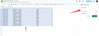
- Select your data range

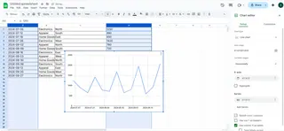
Go to Insert > Charts
Choose your chart type (column, line, etc.)

- Customize colors and labels
Adding Asterisks - The Simple Way
Here's the step-by-step magic:
- Click on the data point you want to mark
- Right-click and select "Add Data Label"
- Click the label to edit it
- Type an asterisk (*) after the number
- Format it to stand out (try bold or color)
Example: If Q3 sales were unusually high due to a promotion, add "*" next to that bar with a note explaining why.
Taking It Further With Text Boxes
Need more than just an asterisk? Add a text box:
- Go to Insert > Text Box
- Click where you want it on the chart
- Type your explanation (e.g., "*Summer promotion")
- Format to match your chart style
Pro Design Tips
Make your asterisks pop:
- Use contrasting colors
- Make them slightly larger than regular text
- Position them carefully (not covering important data)
Common Mistakes to Avoid
- Don't overdo it - too many asterisks create clutter
- Keep formatting consistent across charts
- Make sure explanations are clear and concise
Level Up With Excelmatic
While manual methods work, Excelmatic's AI-powered charts can automatically:
- Detect and flag outliers
- Add smart annotations
- Generate professional-looking graphs in seconds
Imagine having these tools at your fingertips - no more tedious manual formatting!
Final Thoughts
Adding asterisks might seem small, but it's these details that make your reports stand out. Whether you're presenting to your team or clients, clear visual cues make data easier to understand.
Ready to take your Excel skills to the next level? Excelmatic helps you create stunning, insightful graphs without the hassle. Try it today and see how easy data visualization can be!


