Ever tried explaining a complex chart to someone who can't see it? It's like describing a sunset to someone who's never seen colors. That's where alt text comes in—it's your chart's voice when visuals can't speak for themselves.
At Excelmatic, we know accessibility isn't just about compliance—it's about making sure everyone on your team can work with data equally. Whether you're sharing reports with visually impaired colleagues or just want to make your spreadsheets more searchable, alt text is your secret weapon.
Why Alt Text Matters More Than You Think
Alt text does three crucial things:
- Opens doors for screen reader users to understand your data
- Boosts clarity when sharing charts in presentations or emails
- Future-proofs your work for accessibility requirements
Pro tip: Excelmatic's AI can suggest smart alt text descriptions automatically, saving you time while maintaining quality.
The 5-Minute Guide to Adding Alt Text
Here's the fastest way to make your charts accessible:
- Click your chart to select it
- Right-click and choose "Format Chart Area"
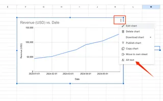
- Find the Alt Text option in the sidebar
- Type your description (keep it under 125 characters)
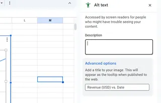
- Save and repeat for other charts
For Excelmatic users: Our platform remembers your alt text preferences across documents, so you can set it once and apply everywhere.
Writing Alt Text That Actually Helps
Bad alt text: "Sales chart" Good alt text: "Q3 sales peak at $250K, up 20% from Q2"
What makes the difference?
- Specific numbers instead of vague descriptions
- Clear trends rather than just labeling
- Actionable insights, not just basic info
Excelmatic's AI analyzer can scan your charts and suggest optimized alt text based on the actual data patterns—no guessing required.
Common Mistakes (And How to Avoid Them)
We've seen these alt text fails too often:
- The novel: Three paragraphs describing every data point
- The ghost: Alt text that's there but says nothing useful
- The robot: "Image of chart showing data" (screen readers already know it's a chart!)
Our solution? Excelmatic's alt text validator flags these issues before you share files.
Advanced Pro Tips
For power users:
- Use Excelmatic's batch processing to add alt text to multiple charts at once
- Create alt text templates for recurring report types
- Integrate with screen readers to test how your descriptions sound
Remember: Great data deserves to be understood by everyone. With these simple steps (and a little help from Excelmatic), you're not just making charts—you're making knowledge accessible.
"Accessibility isn't a feature—it's the foundation of good data communication." — Excelmatic UX Team
P.S. Want to see how Excelmatic can automate your alt text workflow? Try our free AI-powered chart analyzer today.


