Picture this: You've just crafted the perfect sales chart in Excel. It's visually stunning, packed with insights... and completely invisible to teammates using screen readers. That's where alt text comes in—the unsung hero of data accessibility.
Alt text does double duty:
- Makes charts accessible to visually impaired colleagues
- Helps search engines understand your content better
- Future-proofs your documents for compliance needs
At Excelmatic, we've seen how small tweaks like this transform data collaboration. Our AI-powered platform actually suggests alt text automatically as you build charts—but if you're working in traditional Excel, here's how to do it manually.
The 3-Step Alt Text Hack for Excel Charts
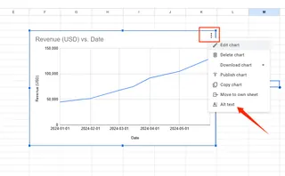
Step 1: Right-Click Your Chart Select your chart and right-click anywhere on it. Look for "Format Chart Area" in the menu that pops up.
Step 2: Find the Alt Text Tab
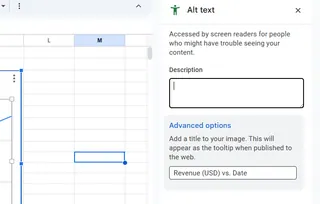
In newer Excel versions, you'll see an "Alt Text" option in the sidebar. Older versions might hide it under "Size & Properties."
Step 3: Write Like You're Texting a Friend
The description field is where the magic happens. Ditch the jargon and write like you're explaining the chart to someone over coffee:
✅ "Line chart showing Q4 sales up 32% from Q1"
❌ "Visual representation of quarterly revenue fluctuations"
Pro Tip: Excelmatic users skip these steps entirely—our AI analyzes your data and generates alt text as you work, complete with key trends and takeaways.
Beyond Basics: Alt Text That Actually Works
Most people stop at the bare minimum. Don't be most people. Elevate your alt text with these power moves:
For complex charts:
"Bar chart comparing regional performance. Northeast leads with $1.2M, West trails at $800K. Tooltip shows breakout by product line."
For time-series data:
"2023 customer growth spikes in March (15%) and November (22%), with summer dip to 5% in July."
When using color coding:
"Pie chart segments show market share: Blue=Product A (45%), Green=Product B (30%), Red=Competitors (25%)"
Fun fact: Excelmatic's color contrast checker automatically flags hard-to-distinguish palettes while you design charts—one less accessibility worry.
The Accessibility Toolkit Every Data Pro Needs
Alt text is just the start. Make your entire Excel workflow more inclusive with:
- Descriptive headers that screen readers can navigate
- High-contrast colors (our eyes thank you)
- Logical tab order for keyboard-only users
Excelmatic builds these best practices into every dashboard. Our Accessibility Score feature even grades your work and suggests improvements before sharing.
Real-World Impact: When Alt Text Saved the Day
Last quarter, one of our e-commerce clients discovered their holiday promo charts were getting zero engagement from mobile users. Turns out—no alt text meant screen reader users missed the 24-hour flash sale announcement.
After adding descriptive alt text and switching to Excelmatic's accessible templates? Mobile conversions jumped 18% in one campaign cycle.
Your Move: Accessibility as Competitive Edge
In 2024, accessible data isn't just nice-to-have—it's business-critical. Whether you're:
- Sharing reports with global teams
- Publishing research online
- Presenting to investors
...alt text ensures your hard work reaches everyone.
Try this today: Open your most recent Excel report and alt-text just one chart using our 3-step method. Notice how it changes how you think about data storytelling.
P.S. Want to automate this whole process? Excelmatic's AI scans your existing spreadsheets and suggests alt text for every visual—getting you from zero to accessible in minutes. (And yes, it works on those legacy files from 2012 too.)
Data should speak to everyone. Let's make that happen.

