Ever sent an Excel report full of charts, only to realize they're useless for colleagues using screen readers? That's where alt text comes in – it's like subtitles for your data visuals. And guess what? AI tools like Excelmatic can generate perfect alt text in seconds.
Why Alt Text Matters More Than You Think
Picture this: Your sales dashboard shows Q3 growth, but visually impaired teammates only hear "image" from their screen reader. Ouch. Alt text fixes this by:
- Making charts accessible to everyone
- Boosting SEO (search engines can't "see" images but read alt text)
- Serving as handy notes for busy coworkers
The Old Way vs. The AI Way
Manually writing alt text is time-consuming. You need to:
- Analyze chart patterns
- Summarize key takeaways
- Keep it concise yet descriptive
With Excelmatic's AI:
- Upload your chart
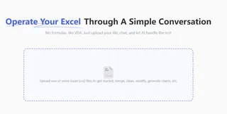
- Let the AI analyze trends
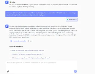
- Get auto-generated, human-like descriptions
Step-by-Step: Adding Alt Text Like a Pro
1. Create Your Chart (The Smart Way)
Instead of basic Excel charts, try Excelmatic's visualization tools that:
- Auto-suggest the best chart type
- Highlight key trends for you
- Prepare alt text suggestions
2. Generate Alt Text with AI
Here's how Excelmatic makes it effortless:
- Right-click your chart → "Generate Alt Text"
- AI scans data points and trends
- Gets you a draft like: "Line chart showing 28% revenue growth Q1-Q3, peaking in August"
3. Fine-Tune Your Description
Even great AI needs human touch:
✔ Keep it under 125 characters
✔ Lead with the main insight ("Sales doubled in Q4")
✔ Mention unusual patterns ("Sudden dip in March")
Pro Tips for Next-Level Accessibility
- For complex charts: Use Excelmatic's "Detailed Description" mode for multi-sentence explanations
- Team workflow: Set up alt text templates for consistent reporting
- SEO bonus: Include keywords naturally ("Ecommerce conversion rates")
Beyond Alt Text: Make Entire Reports Accessible
Excelmatic's Accessibility Toolkit helps:
🔍 Auto-check color contrast
📊 Suggest accessible color palettes
🗣️ Generate audio summaries of data
Try This Today
- Open your latest sales report
- Pick one chart
- Use Excelmatic's free alt text generator
- Share the accessible version with your team
See the difference? That's the power of AI meeting inclusivity. Your data just became everyone's data.
P.S. Need to automate this for 100+ charts? Excelmatic's batch processing handles it while you grab coffee. 🚀

