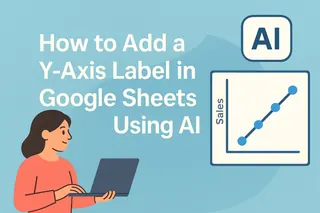
Ever showed someone a chart and watched their face go blank? We've all been there. The problem usually isn't your data - it's missing context. That's where Y-axis labels come in. They're like the GPS for your chart, telling viewers exactly what they're looking at.
At Excelmatic, we see this all the time. Teams spend hours analyzing data, then lose impact because their charts aren't clear. Let's fix that.
Why Y-Axis Labels Matter More Than You Think
Imagine a chart showing rising bars. Without labels, is it sales? Temperatures? Website visits? Your audience shouldn't have to guess.
Good Y-axis labels:
- Explain what's being measured ("Monthly Revenue" vs just "Amount")
- Include units when needed ("$ Thousands" or "°C")
- Make you look pro (messy charts scream "I threw this together")
Pro Tip: Excelmatic users get smart label suggestions automatically based on their data patterns - no manual typing needed.
The Step-by-Step Guide (With Screenshot Walkthrough)
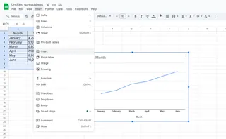
- Select your chart - Click anywhere on the chart in Google Sheets
- Open the Chart Editor - Click the three dots → "Edit chart"
- Find the Label Section - Go to "Customize" → "Chart & axis titles"
- Add Your Label - Choose "Vertical axis title" and type your label
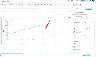
Common Mistake Alert: Don't just write "Values" - be specific! "Q2 Sales Growth (%)" tells a much clearer story.
Level Up Your Labels (Like a Data Pro)
Once you've got the basics, try these power moves:
- Font Tweaks: Make labels bold or larger if presenting
- Color Coding: Match labels to your company branding
- Dual Axes: Show two metrics at once (like revenue and units)
Fun Fact: Excelmatic automatically formats labels based on your company style guide - one less thing to manually adjust.
When Spreadsheets Feel Like Too Much Work...
We get it. Between data entry, formula errors, and formatting charts, spreadsheets can suck up your whole day. That's why we built Excelmatic - the AI assistant that:
✔ Automatically labels charts based on your data
✔ Suggests the best chart types for your numbers
✔ Updates everything when your data changes
Instead of manually tweaking each label, our users get polished, presentation-ready visuals in seconds.
The Bottom Line
Clear Y-axis labels transform confusing charts into communication powerhouses. Whether you're using Google Sheets or tools like Excelmatic, taking those extra few seconds to label properly makes all the difference.
Want to skip the manual work? Try Excelmatic free and let AI handle your chart formatting while you focus on insights.

