Let's be real - nothing kills a data presentation faster than confusing charts. You've crunched the numbers, built beautiful visualizations, but if your audience can't tell what they're looking at, all that work goes down the drain. That's where Y-axis labels come in.
As a growth manager at Excelmatic, I've seen too many teams waste hours manually tweaking charts when AI can do it in seconds. Here's your complete guide to adding Y-axis labels - the old-school way and the smart way.
Why Y-Axis Labels Matter More Than You Think
Imagine showing a sales chart without labeling the Y-axis. Is that $1,000 or $1 million? Percentage points or raw numbers? Labels aren't just decoration - they're the difference between insight and confusion.
Good labels:
- Make your data instantly understandable
- Add professional polish to presentations
- Save you from endless "What does this mean?" questions
The Manual Method (For When You Have Time to Kill)
If you're old-school or just need to tweak one chart, here's how to add Y-axis labels manually:
- Click your chart to select it
- Open the Chart Editor (three dots > Edit chart)
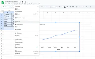
- Go to Customize > Vertical axis
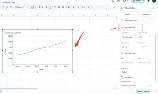
- Click "Title text" and enter your label
- Play with fonts and colors if you're feeling fancy
It works, but let's be honest - doing this for multiple charts is soul-crushing busywork.
Enter Excelmatic: AI-Powered Labeling That Actually Works
Here's where we change the game. Excelmatic's AI understands your data and automatically suggests perfect labels - no manual tweaking needed.
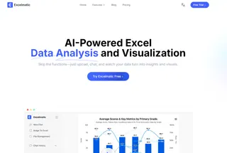
How it works:
- Connect your Google Sheets data
- Let AI analyze your dataset
- Get smart label suggestions tailored to your metrics
- One-click to apply professional labels
We've seen teams cut their chart prep time by 80% using this feature. Instead of guessing at labels, you get data-appropriate suggestions like "Monthly Revenue ($)" or "Customer Growth (%)".
Pro Tips for Next-Level Labels
Whether you're going manual or AI-powered, keep these in mind:
- Be specific but concise ("Q3 Sales" beats "Data")
- Match your company's style guide
- Use units when relevant ($, %, etc.)
- Test with colleagues - if they get it instantly, you've nailed it
The Future Is AI-Assisted Data Storytelling
At Excelmatic, we're betting big on AI that handles the grunt work so you can focus on insights. Our latest updates include:
- Natural language label generation (just describe what you want)
- Automatic label optimization based on viewer role
- Smart formatting that adapts to different devices
Why waste time on manual formatting when AI can do it better, faster, and more consistently?
Your Move
You've got two paths here:
- The slow, manual method that eats up your day
- The smart approach with Excelmatic's AI that gets you back to real work
The choice is obvious. Try Excelmatic free today and see how many hours you can reclaim from chart tweaking hell. Your future self (and your audience) will thank you.
Remember - great data deserves great presentation. Don't let weak labels undermine your hard work.

