Charts turn messy spreadsheets into "aha!" moments. But sometimes you need to spotlight that one game-changing date—a product launch, a policy change, or your best sales day ever. That's where vertical lines come in.
While Google Sheets gets the job done, tools like Excelmatic (our AI-powered data sidekick) can automate this and add smart visual cues automatically. But let’s start with the manual method—it’s useful to understand the basics.
Prep Your Data Like a Spreadsheet Chef
Clean data = clean charts. Here’s how to set up your sheet:
- Open your Google Sheet (or create a new one)
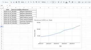
- Organize columns with headers—dates in Column A, values in Column B
- Add a "Vertical Line" column (we’ll use this later)
Pro tip: Excelmatic can auto-structure messy data in seconds—just upload and say "organize by date and values."
Build Your Base Chart
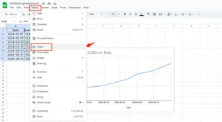
- Highlight your data (Ctrl+A or Cmd+A)
- Click Insert > Chart

- Choose Line chart (or any time-based chart)

Now the fun begins.
Why Vertical Lines Are Secret Superheroes
That thin line can:
- Mark launch dates to measure impact
- Show deadlines in project timelines
- Highlight thresholds (like sales targets)
Example: Add a line at "Black Friday" to instantly see its effect on November revenue.
Adding the Vertical Line: The Hack
Google Sheets needs a workaround since there’s no direct "add line" button. Here’s the trick:
- In your "Vertical Line" column:
- Enter your target value (e.g., "1000") at the specific date
- Leave other cells blank or type #N/A
- Right-click your chart > Edit chart
- Under Series, add your "Vertical Line" column
- Make it stand out:
- Thicker line (3px works well)
- Bold color like red or purple
Frustration saver: If the line disappears, check for blank cells—they break the connection.
Level Up Your Chart Design
- Add data labels: Right-click the line > Add data label
- Adjust axes: Prevent crowding by setting custom min/max values
- Use combo charts: Pair lines with bars for extra clarity
When Spreadsheets Fight Back: Quick Fixes
❌ Line won’t appear?
- Verify all cells in your line column have values or #N/A
- Check the series range includes the new column
❌ Chart looks messy?
- Reduce gridlines (Customize > Gridlines)
- Use a lighter line color
The Smarter Way: Let AI Do the Heavy Lifting
Manually adding lines works, but tools like Excelmatic automate this:
- Upload your data
- Type: "Add vertical line at [date/value] to show [event]"
- Get an interactive chart with smart annotations
No formula wrestling. No formatting headaches. Just instant, presentation-ready visuals.
Beyond Vertical Lines: Google Sheets Pro Moves
While you’re here, try these:
- Sparklines: Mini charts inside cells (great for dashboards)
- Conditional formatting: Auto-color past-due dates
- Pivot tables: Summarize years of data in clicks
Your Turn
Now you’ve got two options:
- Follow these steps next time you need a vertical line
- Try Excelmatic to build charts with AI—including auto-placed markers
Because in 2025, your charts should work for you, not the other way around.


