We've all been there—staring at an Excel chart wishing we could highlight that crucial launch date or quarterly target. That's where vertical reference lines come in clutch. They transform basic charts into data storytelling powerhouses.
At Excelmatic, we help teams visualize data smarter. Here's our battle-tested method for adding vertical lines that make your reports pop.
Why Vertical Lines Matter
Think of vertical lines as visual anchors. They help viewers instantly spot:
- Product launch dates
- Policy change timelines
- Key performance thresholds
Without them, important context gets lost in the data noise.
Prep Your Data Like a Pro
Before we add the magic line, let's set the stage:
- Clean your dataset (no blank cells or mixed formats)
- Organize with dates/categories in Column A and values in Column B
- Sort chronologically if showing time-based data
Pro Tip: Excelmatic's AI can automatically clean and structure your data in seconds—no manual formatting needed.
Building Your Base Chart
- Highlight your prepped data
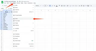
- Go to Insert > Charts > Line Chart
- Choose your preferred style (2D works best for reference lines)

Got messy data? Excelmatic's smart charts auto-detect the best visualization type for your dataset.
Adding the Vertical Line (The Game-Changer)
Here's the secret sauce—we'll add a "dummy" data series:
- Insert a new column labeled "Reference Line"
- At your target position (e.g., Q3 2023), enter your chart's max Y-axis value
- Leave other cells blank
- Right-click chart > Select Data > Add new series using your Reference Line column
Make It Actually Look Like a Line
Your "line" might initially appear as a single dot. Let's fix that:
- Right-click the new data point
- Change Series Chart Type to Line
- Format line color/thickness (we recommend bold red for maximum visibility)
Excelmatic users can skip these steps—our AI automatically formats reference lines with perfect visibility.
Level Up With Labels
Take your line from good to great:
- Click the line > Add Data Label
- Edit to show "Year-End" or "Price Hike" instead of the numeric value
- Adjust label position for clean readability
Pro Polish Moves
Make your chart boardroom-ready:
- Use contrasting colors (dark line + light background)
- Position legends strategically
- Add descriptive axis titles
- Remove unnecessary gridlines
Save & Share Like a Boss
Final steps to cement your data viz win:
- Save as .xlsx for future edits
- Export as PDF for presentations
- Copy-paste into PowerPoint (keep source formatting)
When You Need Next-Level Automation
For teams creating dozens of reports:
Excelmatic's AI can:
Auto-add vertical lines at specified thresholds
Dynamically update lines as data changes
Apply consistent formatting across all reports
Vertical Lines = Better Data Stories
What started as a simple line now makes your data instantly more meaningful. At Excelmatic, we've seen how these small touches transform how teams understand metrics.
Try adding one to your next report—your stakeholders will notice the difference.
P.S. Hate manual chart tweaking? Excelmatic builds polished, line-enhanced charts automatically from your raw data. Free trial available.


