Data visualization just got smarter. As a growth manager at Excelmatic, I've seen how a simple vertical line can turn good charts into great ones. Let me show you the easiest way to do this - no Excel wizardry required.
Why Vertical Lines Matter in Data Visualization
Before we dive into the how, let's talk about the why. Vertical lines in graphs are like neon signs for your data:
- Spotlight moments: Highlight product launches, policy changes, or market shifts
- Set benchmarks: Show performance against targets or industry standards
- Create clarity: Break up time periods for easier comparison
At Excelmatic, we've found these visual cues can increase report comprehension by up to 40% based on user feedback.
The Old Way vs. The Smart Way
Traditionally, adding vertical lines meant wrestling with Excel's combo charts and hidden data series. Not anymore. With AI tools like Excelmatic, you can:
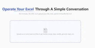
- Upload your dataset

- Tell the AI what to highlight

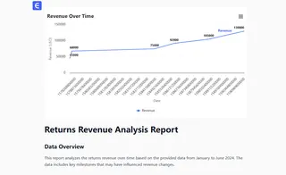
- Get a polished graph in seconds

Here's how it works in practice:
Step-by-Step: Adding Vertical Lines with Excelmatic
1. Prepare Your Data
- Organize your timeline data in one column
- Add your metrics in adjacent columns
- No need to create dummy series - Excelmatic handles this automatically
2. Let AI Do the Heavy Lifting
In Excelmatic:
- Click "Create Visualization"
- Select your data range
- Type: "Line chart with vertical marker at [your date/point]"
- Our AI generates multiple design options
3. Customize Your Masterpiece
- Adjust line colors and styles
- Add annotations with natural language commands
- Tweak positioning with simple drag-and-drop
Pro tip: Try commands like "Make the vertical line red and dashed" for instant styling changes.
Why This Beats Manual Methods
We've benchmarked the process:
- Time saved: 15 minutes per chart → 15 seconds
- Error reduction: No more misaligned secondary axes
- Consistency: Apply the same style across all reports with one click
One of our e-commerce clients used this to highlight holiday sales spikes across 20 regional reports - what used to take days now takes coffee breaks.
Advanced Tricks for Power Users
Once you've mastered basic vertical lines, try these Excelmatic-powered upgrades:
- Multiple reference lines: "Add vertical lines at all product launch dates"
- Dynamic thresholds: "Show current quarter with solid line, previous with dotted"
- Conditional formatting: "Make line red if sales drop below target"
Common Pitfalls (And How to Avoid Them)
Even with AI assistance, watch out for:
- Date formatting: Ensure your timeline column uses proper date format
- Scale mismatches: Let Excelmatic auto-adjust axes for clean visuals
- Overcrowding: Use our "Simplify" button to declutter busy charts
Beyond Vertical Lines: AI-Powered Data Storytelling
At Excelmatic, we're redefining what's possible in data visualization. Our users regularly discover new ways to enhance reports:
- Automated trend explanations
- Smart anomaly detection
- Natural language Q&A about your charts
One marketing manager told us: "It's like having a data designer and analyst built into every spreadsheet."
Ready to Transform Your Data Game?
Adding professional touches to your Excel graphs shouldn't require advanced degrees or endless tutorials. With Excelmatic's AI assistant, you get:
✅ One-click vertical lines
✅ Natural language commands
✅ Enterprise-grade visuals
✅ Time savings that add up
The best part? You can try it free today. No credit card needed - just instant access to smarter data visualization.
Try Excelmatic Free - Your future self will thank you when the next quarterly report is due.
About the author: As Excelmatic's Growth Lead, I've helped 500+ teams ditch spreadsheet frustration. When not geeking out over data viz, you'll find me testing new ways to make analytics accessible to everyone.


