Spotting patterns in your data shouldn't feel like solving a Rubik's cube blindfolded. Whether you're tracking sales growth, analyzing survey results, or monitoring project metrics, trendlines are your secret weapon for making sense of the numbers.
Here's the good news: You've got two paths to trendline mastery. The manual Google Sheets method works fine, but why stop there when Excelmatic can automate the entire process with AI-powered precision? Let's explore both approaches.
The Quick-Start Guide to Trendlines
Before we dive deep, here's what you'll accomplish:
- Create professional scatter plots
- Add customized trendlines
- Interpret the results like a data pro
- Discover how Excelmatic handles this automatically
Setting Up Your Data Playground
Every great analysis starts with clean data. Organize your variables like this:
| Hours Worked (X) | Revenue (Y) |
|------------------|-------------|
|       20         |    $500     |
|       35         |    $800     |
Pro tip: Excelmatic's smart data cleaning feature can automatically structure messy datasets in seconds - just upload and let the AI work its magic.
Creating Your Scatter Plot (The Traditional Way)
- Highlight your data range
- Click Insert > Chart
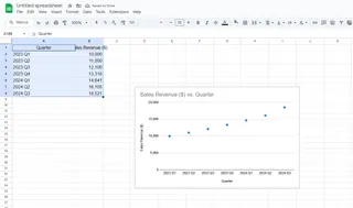
- Choose "Scatter chart" from the dropdown
- Voilà! Your dots are now plotted

But here's where most guides stop short. That basic scatter plot is like a cake without frosting - functional but missing the wow factor.
Adding the Trendline (Manual Method)
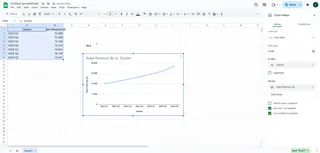
- Click your chart to activate the editor
- Navigate to Customize > Series
- Toggle the Trendline option
- Choose your line type (linear, exponential, etc.)

While this works, it's 2024 - shouldn't data visualization be smarter?
Why Settle for Manual When AI Exists?
Imagine describing what you need in plain English: "Show me the relationship between marketing spend and conversions with an exponential trendline"
Excelmatic does exactly that, generating not just the trendline but the entire analysis in seconds. No menu diving, no guesswork - just instant insights.
Interpreting Like a Data Whisperer
Your trendline tells a story:
- ↗️ Upward slope = Positive correlation
- ↘️ Downward slope = Negative correlation
- Steepness = Strength of relationship
Excelmatic takes interpretation further with automated insights that explain what the trend actually means for your business.
Common Pitfalls (And How to Avoid Them)
Watch out for these rookie mistakes:
- Using linear trends for clearly curved data
- Ignoring outliers that skew results
- Forgetting to check R² values for fit accuracy
Here's where Excelmatic shines - its AI automatically selects the optimal trendline type and flags potential data issues before they mislead you.
From Spreadsheet to Boardroom
Once perfected, you'll want to share your findings:
- Export as high-res images
- Embed in presentations
- Collaborate with teammates
Excelmatic elevates this with one-click report generation - transforming raw data into client-ready dashboards automatically.
The Future-Proof Alternative
While Google Sheets gets the job done, Excelmatic represents the next evolution in data analysis:
- AI-powered chart generation
- Natural language commands
- Automated trend detection
- Real-time collaboration
Why waste time clicking through menus when you could be getting answers?
Your Data, Supercharged
Adding trendlines manually teaches valuable fundamentals, but professional analysts know efficiency is everything. With Excelmatic:
- Upload your dataset
- Ask for what you need
- Get polished, insightful visualizations
No more wrestling with chart editors. No more second-guessing your trendline choices. Just faster, smarter data storytelling.
Ready to work at the speed of thought? Try Excelmatic free today and experience the future of data analysis.


