Data tells stories—if you know how to listen. As a growth manager constantly analyzing user metrics, I've found scatter plots with trendlines to be one of the most powerful ways to spot patterns hiding in spreadsheets. The best part? You don't need to be a data scientist to create them.
Why Trendlines Matter (Especially for Business Users)
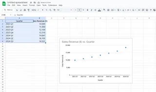
Scatter plots show relationships between two variables—like website traffic vs. conversions or ad spend vs. sales. But trendlines take it further by revealing the underlying direction of your data. That upward-sloping line through your quarterly revenue points? That's your growth trajectory visualized.
At Excelmatic, we've seen how these simple visuals help teams:
- Identify growth opportunities (that steepening curve?)
- Spot potential issues (why's that line flattening?)
- Communicate insights faster (no one wants raw data dumps)
Creating Your Scatter Plot: The Foundation
Before adding trendlines, you need the right canvas. Here's how to set up your scatter plot in Google Sheets:
- Organize your data in two columns (e.g., Column A: Time Period, Column B: Metric)
- Highlight both columns
- Click Insert > Chart
- In the Chart Editor, select "Scatter chart" from the dropdown
Pro tip: Clean your data first. Blank cells or text entries can break your visualization. Excelmatic's AI can automatically detect and fix these issues if you're working with messy datasets.
Adding Trendlines the Traditional Way
Google Sheets makes adding basic trendlines straightforward:
- Click your scatter plot to activate the Chart Editor
- Navigate to Customize > Series
- Scroll down and check the "Trendline" box
- Choose your trendline type (Linear works for most business cases)
- Customize the color/thickness for clarity
But here's the catch—this method gives you a "dumb" line. It doesn't explain why the trend exists or predict where it's heading. That's where AI-enhanced tools change the game.
The Smarter Approach: Let AI Do the Heavy Lifting
Excelmatic transforms this process from manual plotting to intelligent analysis. Here's how our users add AI-powered trendlines:
- Connect your Google Sheets data to Excelmatic
- Ask our AI: "Show me the trend between [variable X] and [variable Y]"
- Get back:
- The visualized trendline
- Strength assessment (R² value)
- Plain-English insights like "This 15% monthly growth suggests..."
- Automatic outlier detection
Last quarter, our e-commerce clients used this to spot that their conversion rate trend wasn't just growing—it was accelerating. That insight led them to double down on high-performing channels.
Pro Tips for Maximum Impact
- Compare multiple trends: Overlay trendlines for different customer segments
- Forecast forward: Use the "Extend trendline" option to project future performance
- Label wisely: Display the equation/R² value when presenting to stakeholders
When Things Go Wrong (And How to Fix Them)
Common issues we see:
- Flatlined trendlines: Usually means no correlation—or you need a different trend type (try polynomial)
- Wildly inaccurate lines: Check for outliers skewing results (Excelmatic flags these automatically)
- Missing data points: Ensure all values are numbers (no "#N/A" or text)
Real-World Use Cases We Love
- Marketing teams tracking campaign performance over time
- Product managers correlating feature usage with retention
- Finance teams modeling revenue growth scenarios
Why Stop at Basic Trendlines?
With tools like Excelmatic, you're not limited to simple linear trends. Our AI can:
- Recommend the most statistically significant trend type
- Highlight changing trend patterns (like seasonal spikes)
- Automatically update visuals as new data comes in
The result? You spend less time building charts and more time acting on their insights.
Ready to upgrade your data analysis? Excelmatic turns your Google Sheets into an AI-powered insights engine. Try it free and see how much time you can save on manual charting.

