Ever stared at an Excel chart and thought, "What am I even looking at?" You're not alone. Chart titles are the unsung heroes of data visualization - they transform confusing graphs into clear insights in seconds.
As someone who's analyzed thousands of data sets, I can tell you: the difference between good and great data presentation often comes down to simple touches like proper chart titling.
Why Chart Titles Matter More Than You Think
Picture this: You're presenting quarterly sales data to your team. The numbers are perfect, the trends are clear - but without a title, everyone's spending the first two minutes just figuring out what they're seeing.
Chart titles serve three crucial purposes:
- Instant context: Like a newspaper headline, they tell viewers what to focus on
- Organization: Makes it easy to identify charts in complex reports
- Professionalism: Shows you've put thought into your data presentation
Pro tip: If you're tired of manual chart formatting, tools like Excelmatic can automate this process while maintaining perfect consistency across all your visuals.
How to Add a Basic Chart Title in Excel
Let's break this down into simple steps even Excel beginners can follow:
- Select your chart - Click anywhere on the chart (you'll see border handles appear)
- Find the Chart Design tab - This appears in the ribbon when your chart is selected
- Click "Add Chart Element" - Located in the Chart Layouts group
- Choose "Chart Title" → "Above Chart" for standard placement
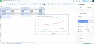
- Click the title box and type your descriptive text

That's it! You've just made your chart infinitely more useful. But we're just getting started...
Level Up: Customizing Your Chart Titles
Basic titles get the job done, but customized titles make your charts shine. Here's how to make yours stand out:
Font Formatting
- Change font style/size via the Home tab
- Match your company branding colors
- Use bold for emphasis (but don't overdo it)
Advanced Formatting Options
Right-click your title and select "Format Chart Title" to access:
- Fill colors (subtle backgrounds work best)
- Text effects like shadows or glow
- Border styles for framed titles
Pro tip: Excelmatic users can apply these formatting changes across multiple charts simultaneously using style templates - a huge time saver for recurring reports.
The Secret Weapon: Dynamic Chart Titles
Here's a game-changer most Excel users don't know about - titles that update automatically:
- Click your chart title
- In the formula bar, type "="
- Click the cell containing your desired title text
- Press Enter
Now when that cell updates, your chart title updates too. Perfect for dashboards and reports that refresh regularly!
Common Title Mistakes to Avoid
After reviewing thousands of charts, these are the most frequent title blunders I see:
- The Too-Vague Title: "Sales Data" → Better: "Q2 2023 E-Commerce Sales by Region"
- The Novel: Overly long titles that overwhelm
- The Inconsistent: Changing styles between related charts
- The Forgotten: Not updating titles when data changes
Pro Tips for Next-Level Charts
Want to impress your boss or clients? Try these advanced techniques:
- Add subtitles for extra context (Format Chart Title → Title Options)
- Align with axis labels for clean composition
- Use brand fonts/colors for professional consistency
- Consider placement - Centered overlay can save space
Real-World Example: From Basic to Brilliant
Let's transform a mediocre title into a great one:
Before: "Monthly Sales" After: "2023 Product Sales Trend (Jan-Dec) | 15% YOY Growth"
See the difference? The improved version tells the whole story at a glance.
Beyond Basic Excel: When to Upgrade Your Tools
While Excel works fine for simple charts, modern teams are switching to AI-powered tools like Excelmatic that:
- Auto-generate perfect chart titles based on your data
- Apply consistent formatting across all visuals
- Update titles dynamically as data changes
- Offer advanced customization without the complexity
The bottom line? A great chart title turns data into insight. Whether you stick with Excel or upgrade to smarter tools, taking those extra few seconds to craft clear, compelling titles will make all your data work more effective.
Remember: In data visualization, clarity always wins. Your charts should tell their story before anyone has to ask "What does this mean?"


