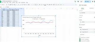
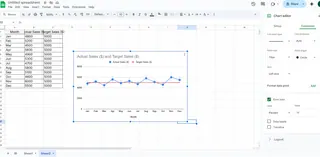
We've all been there - staring at a sales chart wondering if we're hitting targets. That's where target lines come in. They're like the finish line in a race, giving you instant visual feedback on performance.
At Excelmatic, we help teams visualize data effortlessly, but we know many still rely on Excel for quick charts. Here's how to supercharge your Excel charts with target lines.
Why Target Lines Matter
Target lines turn good charts into great ones. They:
- Show progress at a glance
- Highlight over/under performance
- Make reports instantly understandable
Imagine tracking monthly sales without knowing your goal. That's like driving without a destination. Target lines give your data context.
Setting Up Your Data
Clean data = better charts. Here's how to prep:
- Organize your actual data (like monthly sales)
- Add a target column with your goal values
- Keep dates or categories in the first column
Pro tip: Use Excelmatic to automatically structure messy data before importing to Excel.
Creating Your Base Chart
- Select your data (including targets)
- Go to Insert > Charts
- Choose column or line chart

Now you've got the foundation. Time for the magic touch.
Adding the Target Line (3 Methods)
1. Secondary Axis Method (Most Common)
- Right-click chart > Select Data
- Add your target data as a new series
- Right-click target series > Change Chart Type > Line
- Check "Secondary Axis"
- Format to make it stand out
This keeps your scale clean while showing targets clearly.
2. Error Bars Technique
Great for showing variance:
- Select your data series
- Go to Chart Tools > Error Bars
- Set custom values based on target differences

The bars visually show how far you are from goals.
3. Conditional Formatting
Not a true line, but useful for tables:
- Select your data range
- Home > Conditional Formatting
- Set rules for above/below target
Perfect for quick spreadsheet checks.
Making It Look Professional
A few tweaks make all the difference:
- Use contrasting colors (red for below, green for above)
- Add data labels to targets
- Keep it simple - don't overcrowd
Excelmatic users: Our AI suggests optimal formatting based on your data type.
Dynamic Target Lines
Goals change. Your charts should too. Simply:
- Update your target column
- The chart automatically adjusts
No manual tweaking needed.
Common Mistakes to Avoid
We see these often:
- Forgetting to include target data in the initial selection
- Using confusing color schemes
- Overcomplicating with too many elements
Remember: The goal is clarity, not creativity.
When to Upgrade from Manual Charts
If you're constantly:
- Remaking the same charts
- Struggling with data formatting
- Explaining charts to colleagues
It's time to try Excelmatic. Our AI transforms raw data into polished dashboards in seconds, complete with automatic target lines and insights.
Final Pro Tips
- Save your formatted chart as a template
- Use named ranges for dynamic targets
- Combine with other visuals like sparklines
Target lines are just the beginning. With the right tools, you can turn basic data into compelling stories that drive action.
Ready to take your data viz to the next level? Excelmatic makes professional charts effortless - no Excel expertise needed. Try it free today and see the difference AI-powered analysis can make.


