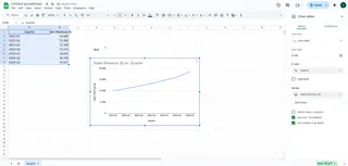
We’ve all been there—staring at an Excel sheet full of numbers, trying to spot trends. A basic graph helps, but adding a slope? That’s where the magic happens. Slopes turn your data into a crystal ball, showing not just what’s happening but how fast it’s changing.
At Excelmatic, we help teams automate this process with AI, but let’s start with the manual method (and why you might want to upgrade later).
Step 1: Create Your Base Graph
- Select your data (e.g., dates in Column A, sales in Column B).
- Go to Insert > Line Chart.
- Boom—you’ve got a visual starting point.

Pro Tip: Excelmatic users skip this step entirely. Just upload your data and say, “Show me trends,” and the AI builds interactive graphs with slopes automatically.
Step 2: Add the Slope (Trendline)
- Right-click any data point > Add Trendline.
- Choose Linear for a straight slope line.
- Check Display Equation to see the exact slope formula (like y = 2x + 5).
Why this matters: A positive slope means growth (great for revenue!). Negative? Time to troubleshoot.
Step 3: Customize for Clarity
- Change the trendline color to red for urgency.
- Adjust thickness under Format Trendline.
- Use Forecast to project future values (handy for budgets!).
Excelmatic shortcut: Our AI suggests the best slope style based on your data type—no manual tweaking needed.
Common Pitfalls (And How to Avoid Them)
- Mismatched data ranges: Double-check your selections.
- Wrong trendline type: Linear works for most cases.
- Over-trusting predictions: Slopes show trends, not certainties.
How we help: Excelmatic flags inconsistencies in your data before analysis, so slopes stay accurate.
When to Use Slopes in Real Life
- Sales teams: Track monthly growth rates.
- Marketers: Measure campaign performance over time.
- Personal finance: Predict when your coffee budget will bankrupt you.
Upgrade to AI-Powered Slopes
Manually adding slopes works, but it’s 2024—why waste time? Excelmatic lets you:
✅ Generate slope graphs in one click
✅ Compare multiple trends side-by-side
✅ Get AI explanations of what slopes mean for your business
Try it free: Link to Excelmatic
Final Thought: Slopes turn data from “interesting” to “actionable.” Whether you DIY it in Excel or let AI handle the heavy lifting, understanding trends is the first step to smarter decisions.
About the author: As a growth lead at Excelmatic, I help teams replace spreadsheet busywork with AI. My mission? Make data analysis as easy as ordering coffee.


