Excel is that reliable coworker who never calls in sick—always ready to crunch numbers and organize your chaos. But when you need to calculate slopes to spot business trends, even Excel can feel like climbing a mountain without gear. Good news: adding slope equations is easier than you think, and tools like Excelmatic can automate the entire process.
Let’s break it down. A slope isn’t just math jargon—it’s your secret weapon for spotting growth patterns, sales trends, or even customer behavior shifts. Here’s how to master it in Excel (and when to let AI do the work).
Slope 101: What It Is and Why It Matters
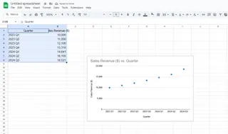
Imagine plotting your monthly sales on a graph. The slope tells you how steep that growth line is—whether you’re skyrocketing (+ slope) or need a strategy boost (– slope). The formula? Simple:
Slope = (y₂ - y₁) / (x₂ - x₁)
But who wants to calculate that manually for 100+ data points? Not you.
Option 1: Manual Slope Calculation (For the Curious)
- List your data: Column A (x-values) vs. Column B (y-values).
- Pick two points: Say, rows 2 and 3.
- Apply the formula:
=(B3-B2)/(A3-A2)in a new cell.
This works for small datasets, but let’s be real—you’ve got better things to do than math homework.
Option 2: Excel’s SLOPE Function (The Smart Shortcut)
- Organize data: Keep x and y values in separate columns.
- Use
=SLOPE(known_y’s, known_x’s): Example:=SLOPE(B2:B100,A2:A100). - Hit Enter: Boom—Excel does the heavy lifting.
Still too manual? Enter Excelmatic. Just upload your data, ask for a slope analysis, and watch it generate the equation and visuals automatically. No formulas, no fuss.
Visualizing Slopes Like a Pro
A slope equation is useless without context. Here’s how to turn numbers into insights:
- Create a scatter plot: Highlight data > Insert > Scatter.

- Add a trendline: Click the “+” on your chart > Check “Trendline.”
- Show the equation: Right-click trendline > “Display Equation.”
With Excelmatic, this happens in one click. It even suggests interpretations like, “Your Q3 sales slope increased by 15%—time to ramp up inventory!”
Watch Out for These Pitfalls
- Garbage in, garbage out: Typos skew results. Double-check data.
- Forcing linear trends: Not all relationships are straight lines. Try Excelmatic’s smart detection to suggest the best model.
- Ignoring outliers: That one weird data point? It might be your most valuable insight.
When to Upgrade to AI Tools
Excel’s SLOPE function is great, but if you’re:
- Analyzing large datasets
- Creating weekly/monthly reports
- Sharing findings with non-data teams
…then Excelmatic is your MVP. It automates slope calculations, generates polished dashboards, and even explains trends in plain English.
Bottom Line
Slope equations unlock trends hidden in your data. While Excel can handle the math, tools like Excelmatic transform numbers into actionable stories—no PhD required.
Pro tip: Try Excelmatic’s free plan to automate your next slope analysis. Your future self (and your team) will thank you.
Need more Excel hacks? Check out our guides on R² values and dynamic charts.


