Let's be real - we've all been there. You're staring at a spreadsheet full of juicy business data, ready to turn those numbers into beautiful charts. But when you try to add that second product line or extra month of sales data to your chart, things get messy fast.
As a growth manager, I live for data visualization. Charts are our secret weapon for spotting trends, proving ROI, and convincing stakeholders. But building them manually? That's so 2022.
Why Series Matter in Your Data Story
A chart series is basically a set of related data points you want to compare - like monthly sales for different products or website traffic by channel. The magic happens when you layer multiple series together to tell a complete story.
Imagine you're tracking:
- Organic vs paid traffic (2 series)
- Sales by product line (multiple series)
- Monthly growth across regions (you get the idea)
Single-series charts are like watching a movie with one character. Multi-series charts? That's your full ensemble cast bringing the drama.
Google Sheets Charting 101
Before we add series, let's set up our data right:
- Clean your data - No blank rows, consistent formatting
- Label everything - Clear headers for each column
- Highlight your range - Select all the data you want to chart
Pro tip: If you're already dreading the manual work, Excelmatic can analyze your raw data and suggest perfect chart types automatically.
Adding Your First Series (The Manual Way)
Here's how to add series in Google Sheets:
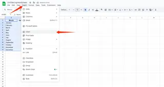
- Select your data and click Insert > Chart
- In the Chart Editor, go to Setup tab
- Click "Add Series" and select your new data range
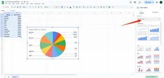
- Customize colors and styles to make each series pop
But let's be honest - clicking through menus isn't why you got into growth hacking.
The Smart Alternative: AI-Powered Charting
Here's where Excelmatic changes the game. Instead of manually adding each series:
- Upload your spreadsheet
- Tell it what you want to compare (e.g., "Show me monthly sales by product")
- Watch as it instantly generates perfectly formatted multi-series charts
The best part? It automatically:
- Picks the right chart type
- Styles each series for maximum clarity
- Updates when your data changes
Pro Tips for Chart Clarity
Whether you're going manual or AI-assisted, keep these in mind:
- Limit your series - 3-5 is the sweet spot before charts get messy
- Use contrasting colors - Help viewers distinguish series at a glance
- Add data labels - When precise numbers matter more than trends
- Try different chart types - Line charts for trends, bars for comparisons
When Manual Charting Drives You Crazy
We've all wasted hours fixing:
- Misaligned data points
- Disappearing series
- Cluttered legends
- Formatting that resets randomly
That's why our team switched to Excelmatic for all our reporting. What used to take an afternoon now takes minutes, leaving us more time for actual analysis.
Ready to Upgrade Your Data Viz Game?
Adding series in Google Sheets is a useful skill, but in 2024, growth teams need faster solutions. With Excelmatic, you get:
✅ Automatic multi-series chart generation ✅ Smart formatting that actually looks good ✅ Real-time updates as data changes ✅ No more menu diving or troubleshooting
Why spend your time building charts when you could be finding the next big growth opportunity? Let AI handle the busywork while you focus on insights.
Try Excelmatic free and see how easy data visualization can be. Your next board deck will thank you.

