Let's be real - staring at raw spreadsheet numbers makes everyone's eyes glaze over. But when you transform that data into a clear visual chart? Suddenly, everyone's paying attention. The real magic happens when you need to add another layer of information to your existing chart.
Here's the good news: adding a new data series in Google Sheets is way easier than you think. Even better? With AI tools like Excelmatic, you can automate most of the heavy lifting. Let me walk you through the manual method first, then I'll show you how AI can make this process ridiculously simple.
Why Add More Data to Your Chart?
Picture this: you've got a slick bar chart showing last quarter's sales. Your boss loves it, but now wants this quarter's numbers layered on top. Instead of creating a whole new chart, you can just add the new data as another series.
Benefits of adding series:
- Compare apples to apples: See trends and patterns between different data sets at a glance
- Save real estate: Keep your dashboard clean instead of cluttering it with multiple charts
- Tell better stories: More data means more insights you can visualize
Setting Up Your Data Like a Pro
Before we touch any charts, let's get the foundation right. Messy data = messy charts. Here's how to organize your spreadsheet:
- Column headers matter: Name each column clearly (like "Q3 Sales" and "Q4 Sales")
- Keep it tidy: Make sure all your data aligns properly with no missing values
- Future-proof it: Leave room to add more columns as you get new data
Pro tip: If you're using Excelmatic, you can skip this manual setup - just upload your raw data and the AI will automatically structure it for visualization.
Creating Your First Chart (The Easy Part)
Now the fun begins. Here's how to make your starter chart:
- Highlight your data range (including headers)
- Click Insert > Chart in the menu
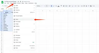
- Pick your chart type (column charts work great for comparisons)
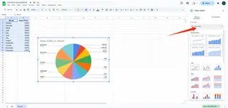
Boom - instant visualization. But we're just getting started.
Adding Your New Data Series
This is where most people get stuck, but it's actually simple:
- Click your chart, then hit those three dots > Edit chart
- Find the Series tab in the sidebar
- Click "Add series" and select your new data column
Like magic, your chart now shows both data sets. Want to make it pop even more? Try these quick customizations:
- Color code each series differently
- Add data labels for crystal-clear reading
- Adjust the legend so it doesn't block your data
How AI Takes This to the Next Level
Here's where things get really interesting. With Excelmatic, you can:
Upload messy, raw data files
Tell the AI what you want to visualize (e.g., "Show me a bar chart of monthly sales with dollars value")
Let it automatically:
- Clean and organize your data
- Create the perfect chart type
- Add all relevant data series
- Apply professional styling
Instead of spending 15 minutes manually adding series, the AI does it in seconds. Plus, it suggests insights you might have missed.
Common Pitfalls (And How to Avoid Them)
Even with AI help, watch out for:
- Mismatched ranges: Make sure all series cover the same time periods
- Overcrowding: Too many series makes charts unreadable - 3-5 is usually the sweet spot
- Wrong chart type: Line charts for trends, bars for comparisons, etc.
Pro Tips for Chart Masters
Once you've got the basics down, try these power moves:
- Save templates for reports you make regularly
- Use conditional formatting to highlight key data points
- Set up automatic data refreshes so charts update themselves
Sharing Your Masterpiece
The whole point of great charts is sharing insights. Google Sheets makes collaboration easy:
- Share editable links with teammates
- Set different permission levels
- Collaborate in real-time with comments
The Bottom Line
Adding data series to charts transforms good visualizations into great ones. While Google Sheets makes the manual process straightforward, AI tools like Excelmatic can automate 90% of the work while uncovering hidden insights.
Whether you're a spreadsheet newbie or a seasoned pro, combining manual techniques with AI assistance gives you the best of both worlds - control when you want it, automation when you need it.

