Let's be real - building charts in Google Sheets shouldn't feel like solving a Rubik's cube. As someone who's spent countless hours wrestling with spreadsheet data, I can tell you there's a smarter way. AI tools like Excelmatic are changing the game by automating the tedious parts of data visualization.
Why AI is Your New Charting Assistant
Remember when you had to manually add every new data series? Those days are over. Modern AI tools can:
- Automatically detect patterns in your data
- Suggest relevant additional series
- Update charts dynamically as new data comes in
Excelmatic leads the pack here with its intuitive AI that understands your data context. It's like having a data analyst sitting right beside you.
Getting Your Data Ready for AI Magic
Before the AI can work its magic, your data needs to be in shape. Think of this like prepping ingredients before cooking:
- Clean your data: Remove duplicates and fix formatting issues
- Organize logically: Use clear headers and consistent structures
- Check completeness: Fill in missing values where needed
Pro tip: Excelmatic's data cleaning features can handle much of this prep work automatically, saving you tons of time.
Creating Your Starter Chart (The Easy Part)
Here's the basic process to create your initial chart:
- Highlight your prepared data range
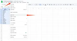
- Click Insert > Chart in Google Sheets
- Choose your chart type (bar, line, etc.)
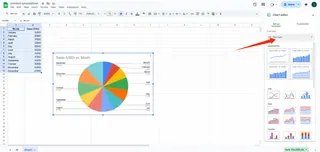
- Do some light customization
This gives you a solid foundation. But the real magic happens when we bring in AI for enhancement.
Adding Series the Smart Way with AI
This is where Excelmatic shines. Instead of manual series additions:
- Connect Excelmatic to your Google Sheet
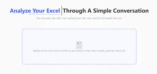
- Let it analyze your data patterns
- Review its intelligent series suggestions
- Apply the ones that make sense
The AI might spot trends you'd miss, like seasonal patterns or correlations between metrics. It's like having x-ray vision for your data.
Manual Series Addition (When You Need Control)
Sometimes you want full control. Here's how to add series manually:
- Click your chart > Edit chart
- Navigate to Series in Chart Editor
- Click "Add series" and select your data range
- Customize the appearance
While manual works, it's time-consuming for complex datasets. That's why we recommend starting with AI suggestions first.
Pro Tips for Next-Level Charts
To make your charts truly stand out:
- Use contrasting colors for different series
- Add clear, descriptive labels
- Keep it simple - don't overload with too many series
- Use Excelmatic's style suggestions for professional polish
Keeping Charts Fresh with Dynamic Data
Static charts are so 2010. With Excelmatic, your charts can:
- Auto-update when new data arrives
- Maintain consistent formatting
- Adjust scales intelligently as data changes
This means your reports are always current without constant manual tweaking.
Why Stop at Basic Charts?
Advanced users can leverage AI for:
- Predictive trendlines
- Anomaly detection
- Automated data storytelling
Excelmatic makes these advanced features accessible to everyone, not just data scientists.
Final Thoughts: Work Smarter, Not Harder
Adding data series doesn't need to be a chore. By combining Google Sheets with AI tools like Excelmatic, you can:
- Save hours on manual chart updates
- Discover hidden insights automatically
- Create professional visuals effortlessly
The future of data visualization is here, and it's powered by AI. Why not give Excelmatic a try and see the difference for yourself? Your future self (and your team) will thank you.

