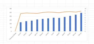
Ever tried comparing sales revenue (in millions) with unit sales (in hundreds) on the same Excel chart? It's like trying to fit an elephant and a mouse on the same weighing scale - one barely shows up! That's where a second vertical axis becomes your data visualization superhero.
At Excelmatic, we help businesses turn messy spreadsheets into clear insights daily. Today, I'll walk you through creating dual-axis charts that make your data tell its full story.
Why Your Charts Need a Second Y-Axis
Picture this: You're presenting monthly performance with both revenue and customer satisfaction scores. The revenue numbers dwarf the 1-10 satisfaction ratings. Without separate scales, your satisfaction line becomes flat as a pancake.
A secondary axis solves this by:
- Giving each metric its own scale
- Showing true relationships between different data types
- Making your charts actually useful for decision-making
Pro tip: Excelmatic's AI instantly suggests when your data needs dual axes, saving you the guesswork.
Prepping Your Data for Dual-Axis Magic
Before we dive into chart creation, let's set up your data right:
- Organize in columns with clear headers (Month, Revenue, Satisfaction)
- No blank rows - Excel hates those
- Keep data ranges consistent
Think of this like prepping ingredients before cooking. Messy data makes messy charts.
Creating Your Combo Chart (The Easy Way)
Here's the fastest path to dual-axis enlightenment:
- Highlight your data (headers included)
- Go to Insert > Charts > Combo Chart
- Select "Custom Combination"

Excel will suggest chart types for each series. Typically:
- Columns for your primary data (like revenue)
- Line for secondary data (like satisfaction scores)
But wait - we're not done yet! The magic happens next.
Adding That Crucial Second Axis
Now for the main event:
- Right-click your secondary data series (the flat-looking one)
- Choose "Format Data Series"
- Check "Secondary Axis"
Boom! Your chart now has two vertical scales. The satisfaction scores suddenly become visible and meaningful.
Excelmatic users get this automatically - our AI detects mismatched scales and suggests dual-axis formatting instantly.
Pro Design Tips for Clarity
Now that you've got both axes, let's make them shine:
- Color code your series (blue columns, orange line)
- Add clear axis titles ("Revenue ($)" vs "Satisfaction (1-10)")
- Adjust scales so both data sets look proportional
- Use data labels sparingly - don't clutter
Remember: The goal is insight, not decoration.
Common Pitfalls to Avoid
From our experience helping thousands of users, watch out for:
- Misleading scales: Don't manipulate axes to exaggerate trends
- Overcrowding: More than 2-3 series becomes confusing
- Wrong pairings: Only compare related metrics (revenue vs units, not revenue vs office temperature)
Excelmatic's smart charts automatically flag these issues, but it's good to know them manually too.
Real-World Examples That Work
Here's how businesses use dual-axis charts effectively:
Marketing Team
- Primary: Ad spend ($)
- Secondary: Conversion rate (%)
Shows ROI at a glance
Operations Team
- Primary: Production units
- Secondary: Defect rate
Spots quality issues
HR Department
- Primary: Hiring numbers
- Secondary: Time-to-hire
Evaluates recruitment efficiency
Beyond Basic Excel: When to Upgrade
While manual dual-axis charts work, they take time. Excelmatic transforms this process by:
- Auto-detecting when you need dual axes
- Applying perfect formatting instantly
- Updating dynamically as data changes
Instead of spending 15 minutes tweaking charts, our users get polished visuals in seconds. More time for analysis, less time wrestling with Excel.
Your Turn to Try
Grab some of your business data and:
- Identify two related metrics with different scales
- Follow our steps to create a dual-axis chart
- Notice how much clearer the relationship becomes
Pro tip: With Excelmatic, just upload your data and say "Show me revenue and customer satisfaction over time" - we'll build the perfect chart automatically.
Final Thoughts
Dual-axis charts transform confusing data into clear business insights. While Excel's manual method works, tools like Excelmatic make this (and hundreds of other analyses) effortless.
Remember: Good data visualization isn't about fancy charts - it's about making the right insights obvious to everyone. Whether you do it manually or with AI assistance, mastering dual axes will make your reports infinitely more valuable.


