Let's be real - staring at spreadsheets all day isn't exactly thrilling. But what if I told you there's a way to make your data tell its own story? That's where trendlines come in. As a growth manager at Excelmatic, I use these daily to spot opportunities and predict outcomes - and today I'll show you exactly how to do it.
Why Trendlines Are Your New Best Friend
Trendlines are like the fortune tellers of your data. They reveal patterns you'd otherwise miss - whether sales are climbing, customer engagement is dropping, or your marketing spend is paying off. The linear trendline is the simplest and most useful for most business scenarios.
At Excelmatic, we've found teams using trendlines:
- Predict next quarter's revenue
- Spot seasonal dips in website traffic
- Validate if that price increase actually boosted profits

Your Step-by-Step Trendline Guide
1. Set Up Your Data Right
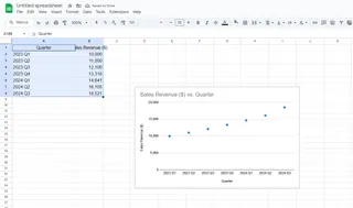
Start with clean data in two columns - your independent variable (like time) and dependent variable (like sales). Pro tip: Excelmatic's AI can automatically clean and structure your data if it's messy.
2. Create a Scatter Plot
- Highlight your data
- Go to Insert > Scatter (X,Y) chart Why scatter? It shows relationships between variables best. If you're tracking trends over time, a line chart works too.

3. Add That Trendline Magic
- Click your chart
- Hit the "+" button
- Check "Trendline" Boom! Excel adds a default linear trendline.
4. Make It Your Own
Right-click the trendline for customization options:
- Change line color/thickness
- Display the equation (y=mx+b)
- Show R-squared value (how well it fits)
- Extend for forecasting
Pro Tips From the Trenches
After helping hundreds of teams with data visualization, here's what most people miss:
Watch for outliers - One weird data point can skew your whole trendline. Excelmatic's anomaly detection flags these automatically.
R-squared isn't everything - A high value (close to 1) suggests a good fit, but always check if the trend makes business sense.
Try different types - If linear doesn't fit, test exponential or polynomial trendlines.
When Manual Gets Tedious...
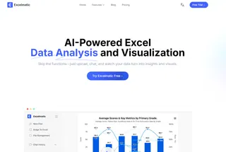
While Excel's trendlines are powerful, creating them manually for multiple datasets eats up time. That's where Excelmatic shines - our AI analyzes your data and suggests the perfect visualizations automatically. Imagine getting:
- Automatic trendline recommendations
- Custom forecasting based on your data
- Real-time updates as new data comes in
From Spreadsheet to Strategy
Trendlines aren't just pretty lines - they're decision-making tools. Here's how our customers use them:
- An e-commerce store spotted a 20% monthly sales growth trend, justifying inventory expansion
- A SaaS company saw declining user engagement, prompting a product redesign
- A restaurant chain forecasted seasonal demand to optimize staffing
Your Turn to Trend
Now you've got the skills to make your data work harder. But remember - the best insights come from pairing human intuition with smart tools. Whether you stick with native Excel or try Excelmatic's automated approach, start spotting those trends today.
What business question could a trendline help you answer right now? Drop it in the comments and I'll suggest how to visualize the answer!


