Let's be real - staring at raw numbers won't tell you where your business is headed. That's where trendlines come in clutch. They're like having a data crystal ball, showing you the hidden patterns in your numbers. And guess what? With AI tools like Excelmatic, this whole process just got way easier.
Why Trendlines Are Your New Best Friend
Whether you're tracking sales, website traffic, or customer growth, a line of best fit helps you:
- Spot trends before they're obvious
- Make smarter predictions
- Present your data like a pro
The best part? You don't need to be a math whiz anymore. Modern AI tools can handle the complex calculations while you focus on the insights.
Getting Your Data Ready
First things first - let's get your data into Google Sheets:
- Open Google Sheets (it's free with your Google account)
- Either type in your numbers or import from CSV/Excel
- Pro tip: Clean up your data first - remove duplicates, fix formatting
Creating Your Scatter Plot
Here's where the magic starts:
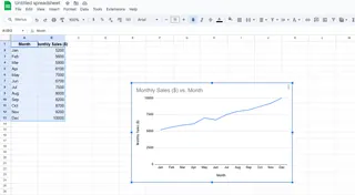
- Highlight your data range
- Click Insert > Chart
- Change the chart type to "Scatter chart" (this is key!)

Scatter plots show each data point individually, making trends easier to spot than with bar or line charts.
Adding That Sweet Trendline
Now for the main event:
- Click on your chart to open the editor
- Go to Customize > Series
- Check the "Trendline" box
Boom! Your line of best fit appears instantly. But we're just getting started...
Level Up with AI (Hello, Excelmatic!)
While Google Sheets gives you basic trendlines, AI tools like Excelmatic take it to the next level:
- Automatically suggests the best trendline type
- Calculates future projections
- Identifies outliers messing with your data
- Generates ready-to-share reports
Here's how to supercharge your analysis:
- Connect Excelmatic to your Google Sheets
- Let it analyze your dataset
- Get AI-powered insights in plain English
No more guessing between linear vs polynomial trends - the AI picks what works best for your specific data.
Reading Between the Lines
Your trendline tells a story:
- ↗️ Upward slope = Positive trend
- ↘️ Downward slope = Negative trend
- ➡️ Flat line = No clear trend
Check the R-squared value too (find it in trendline options). Closer to 1 means your line fits the data well.
Real-World Uses That Actually Matter
This isn't just academic - here's how businesses use trendlines:
- E-commerce: Predict holiday sales spikes
- Marketing: Track campaign performance over time
- HR: Analyze employee retention rates
- Finance: Forecast cash flow needs
Pro Tips for Maximum Impact
- Start with clean data (garbage in = garbage out)
- Try different trendline types if your R-squared is low
- Use AI to handle the complex stats
- Always combine data insights with your business knowledge
Why Stop at Basic Trendlines?
While Google Sheets gets the job done, tools like Excelmatic transform how you work with data:
✅ Automatic data cleaning
✅ Smart trend detection
✅ Future projections
✅ Presentation-ready visuals
No more manual number crunching - just actionable insights served up fresh.
Ready to Work Smarter?
Adding trendlines is just the beginning. With AI-powered tools, you can:
- Automate repetitive analysis
- Get predictive insights
- Create stunning reports in minutes
The future of data analysis isn't about doing more work - it's about working smarter. And that starts with tools that do the heavy lifting for you.
Try Excelmatic free today and see how easy data analysis can be when AI's on your team. Your future self (and your boss) will thank you.


