Ever stared at a messy scatter plot in Excel, wishing you could instantly see the hidden trends? That magical line cutting through the noise is called a line of best fit (or trendline), and it's your secret weapon for spotting patterns and predicting future values.
Here's the game-changer: you don't need to be a data scientist to create perfect trendlines anymore. With AI tools like Excelmatic, what used to take 10 steps now happens in seconds. Let me show you both the traditional method and the smart way to do it.
Why Trendlines Matter (Especially for Business)
Trendlines transform raw numbers into actionable insights. As a growth manager, I use them daily to:
- Spot sales trends before they're obvious
- Predict inventory needs
- Identify marketing campaign performance
The best part? Modern tools have made this accessible to everyone - no advanced math required.
The Old-School Way: Manual Trendline Creation
First, let's cover the traditional Excel method (useful to know, even if we'll upgrade it later):
Create Your Scatter Plot
- Enter your X/Y data in two columns
- Highlight the data → Insert → Scatter Chart
Add the Trendline
- Click your chart → "+" button → Trendline
- Choose "Linear" for most business cases
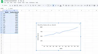
Customize It
- Right-click the trendline → Format Trendline
- Pro tip: Check "Display Equation" for predictions
This works, but it's clunky. Want to see the 2025 approach?
The AI Shortcut: Excelmatic Does It Instantly
Here's how I save hours every week:
- Upload Your Data to Excelmatic (CSV or direct Excel import)
- Ask Naturally: "Show me the trendline for sales vs. ad spend"
- Get Instant Results: The AI creates a polished chart with:
- Perfectly calculated trendline
- Clear equation
- Forecast projections
- Professional styling
No menu diving. No formula troubleshooting. Just insights.
Why Smart Teams Use AI for Trendlines
- Time Saved: What took 15 minutes now takes 15 seconds
- Fewer Errors: No more misaligned data ranges
- Smarter Analysis: The AI suggests the best fit type (linear, polynomial, etc.)
- Presentation-Ready: Automatically styled for reports
Last quarter, this helped my team spot a 22% underperforming product line weeks before traditional methods would have.
Pro Tips for Next-Level Trendlines
- Forecast Forward: Extend your trendline to predict next quarter's numbers
- Compare Multiple Trends: Overlay trendlines for different products
- Watch Your R² Value: Excelmatic shows how well your data fits (aim for >0.7)
Common Pitfalls (And How AI Avoids Them)
Traditional Excel struggles with:
- Non-linear data (AI suggests better fits)
- Missing values (AI handles gaps intelligently)
- Overfitting (AI warns you when trends are unreliable)
Beyond Basic Trendlines
With Excelmatic, you can:
- Create dynamic dashboards that update trends automatically
- Set alerts when trends change significantly
- Share interactive charts with stakeholders
The Bottom Line
While you can manually add trendlines in Excel, AI tools like Excelmatic transform this from a tedious task into a strategic advantage. The next time you need to analyze trends, ask yourself: do you want to wrestle with menus, or get instant, intelligent results?
Ready to upgrade your data game? Try Excelmatic free and see how much time you can save on your next analysis. Your future self (and your boss) will thank you.

