Ever looked at a colorful spreadsheet and thought, "What do all these colors even mean?" You're not alone. Legends are the secret sauce that turns confusing charts into crystal-clear data stories. While Google Sheets makes it easy to add basic legends, customizing them can be tricky - unless you've got AI on your team.
At Excelmatic, we know data visualization shouldn't be a headache. That's why we're showing you two powerful ways to master legends: using our AI-powered spreadsheet magic, and with ChatGPT as your backup guide.
Why Legends Matter (More Than You Think)
Legends are like the decoder rings of data visualization. Imagine a pie chart where red could mean "sales" or "expenses" - without a legend, you're just guessing. Google Sheets automatically adds legends, but they often need tweaking to look professional.
Here's the good news: Whether you use Excelmatic's smart templates or ChatGPT's guidance, perfect legends are just a few clicks away.
The Smart Way: Excelmatic's AI-Powered Legends
Forget manual tweaking. With Excelmatic:
- Upload your data (sales figures, survey results - anything)
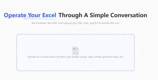
- Describe what you need ("Show monthly sales by product with a top-positioned legend")
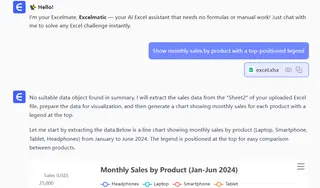
- Watch as our AI generates perfectly formatted charts with optimized legends
Our system automatically:
- Positions legends for maximum clarity
- Matches colors to your brand palette
- Adjusts font sizes for readability
- Even suggests when legends might not be needed
Pro tip: Try our "Smart Legend" feature that automatically adjusts based on your audience's viewing device.
Using ChatGPT as Your Chart Assistant
No Excelmatic access yet? ChatGPT can walk you through manual legend customization:
- Open your Google Sheets chart
- Click the three dots → "Edit chart"
- Navigate to Customize → Legend
- Ask ChatGPT specific questions like:
- "How do I move the legend to the top?"
- "What font size works best for printed reports?"
- "How can I make my legend colors more accessible?"
Remember: While ChatGPT's helpful, it can't directly edit your sheets. For hands-free automation, tools like Excelmatic save hours of manual work.
Pro Customization Tips (Whether You Use AI or Not)
- Positioning Matters: Right-side legends work for most charts, but complex data might need top or bottom placement
- Font Consistency: Match your legend font to your chart titles
- Color Contrast: Ensure legend text is readable against backgrounds
- Mobile Check: Always preview how legends appear on smaller screens
The Future of Data Visualization
Gone are the days of spending hours tweaking chart elements. With AI tools like Excelmatic, you're not just adding legends - you're creating smarter visualizations that adapt to your needs. Our users report saving 3-5 hours weekly on reporting tasks, all while getting better-looking results.
Ready to upgrade your data storytelling? Try Excelmatic's AI-powered charts today - your future self will thank you when those reports practically make themselves.

