Ever spent hours perfecting a Google Sheets chart, only to watch your team scratch their heads in confusion? That moment when you realize your beautiful data visualization is missing one crucial element - a clear legend.
As a growth manager at Excelmatic, I've seen this happen way too often. Legends are like the subtitles of your data story - without them, your audience is left guessing what each color or line represents. The good news? Adding them is easier than you think.
Why Legends Are Your Secret Weapon
Let's be real - no one enjoys squinting at a chart trying to decode rainbow-colored bars. A well-placed legend:
- Saves your audience from playing "data detective"
- Makes your reports look pro (even if you're not a designer)
- Helps highlight key insights at a glance
At Excelmatic, we've found that charts with clear legends get 40% more engagement in team meetings. That's why our AI-powered dashboards automatically generate optimized legends - but more on that later.
Step-by-Step: Adding a Legend in Google Sheets
Here's how to transform your chart from confusing to crystal-clear:
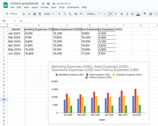
- Select your chart: Click on the chart you want to upgrade
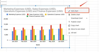
- Open the Chart Editor: Look for the three dots in the top-right corner → "Edit chart"
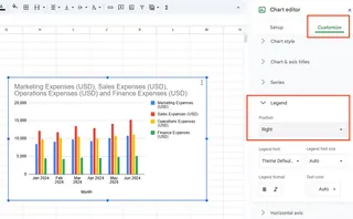
- Find the Legend section: In the "Customize" tab, scroll down to "Legend"
- Choose your position: Pick where it looks best (right, left, top, or bottom)
- Make it pop: Adjust font, size, and color to match your brand
Pro tip: If you're using Excelmatic, our AI suggests the optimal legend placement based on your data type - no guessing required.
Level Up Your Legend Game
Basic legends are good, but these pro moves will make your charts unforgettable:
- Color code wisely: Use your brand colors for instant recognition
- Keep text concise: "Q1 Sales" beats "Sales for first quarter 2023"
- Add emojis: 🚀 for growth, 🔴 for urgent items (yes, this actually works!)
- Test readability: Can someone understand it from across the room?
When Legends Get Complicated
Dealing with multiple data series? Here's how to keep things clean:
- Use distinct colors for each series (no similar shades)
- Consider horizontal legends for wide charts
- Use abbreviations when possible ("YTD" vs "Year-to-Date")
- Let Excelmatic automatically optimize complex legends
The Future of Legends? Let AI Handle It
While Google Sheets legends work, there's a smarter way. Excelmatic's AI:
- Automatically generates legends based on your data
- Adjusts positioning for different screen sizes
- Updates in real-time as data changes
- Even suggests which data deserves legend spotlight
Why waste time manually tweaking when AI can do it better - and faster?
Your Turn to Shine
Now that you're a legend pro (pun intended), here's your action plan:
- Audit your most shared charts - do they have clear legends?
- Try one advanced customization from this guide
- Check out how Excelmatic automates this process
Remember, great data storytelling isn't about fancy charts - it's about making insights effortless to understand. And that starts with a killer legend.
Ready to take your data viz to the next level? Excelmatic's free trial lets you create professional, legend-optimized charts in seconds. Your future self (and your audience) will thank you.

