Let's be real - messy spreadsheets are the worst. You're trying to present important data, but everything blends together in a sea of numbers. That's where horizontal lines come in clutch. They're like visual speed bumps that help organize your info and make key metrics pop.
As a growth manager at Excelmatic, I've seen how small formatting tweaks can transform confusing spreadsheets into clear, actionable dashboards. Here are three ways to add horizontal lines in Google Sheets, plus a game-changing alternative that does the work for you.
Method 1: The Border Trick (Quickest Solution)
This is your go-to when you need simple separation lines fast:
- Highlight the row(s) where you want lines
- Click the borders icon (looks like a grid)
- Select "Bottom border" from the dropdown
- Optional: Customize thickness/color using the style options
Pro tip: Use this for section breaks or to highlight totals. It's basic but effective.
Method 2: Conditional Formatting (For Smart Lines)
Want lines that appear automatically based on your data? This method's for you:
- Select your data range
- Go to Format > Conditional formatting
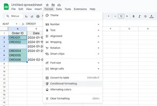
- Choose "Custom formula is"
- Enter a rule like
=A1<>""(adds lines to non-empty cells)
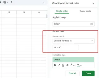
- Set border formatting under "Formatting style"
This creates dynamic lines that update as your data changes - perfect for reports that get frequent updates.
Method 3: The Drawing Tool (For Design Control)
Need pixel-perfect placement? The drawing tool gives you total creative freedom:
- Click Insert > Drawing
- Select the line tool
- Draw your perfect horizontal line
- Customize color/thickness
- Click "Save and Close"
While this offers maximum flexibility, remember these lines won't move with your data - they're fixed objects.
The Smarter Alternative: Let Excelmatic Do It For You
Here's the thing - manually adding lines is so 2023. With Excelmatic, you get:
✅ Automatic formatting based on your data structure
✅ AI-powered visual optimization
✅ Dynamic lines that adjust as data changes
✅ Professional styling with one click
Instead of spending minutes (or hours) tweaking borders, just upload your data to Excelmatic. Our AI analyzes your spreadsheet and suggests optimal formatting, including horizontal lines where they'll have the most impact.
"Excelmatic cut our report formatting time by 80% while making our data easier to understand." - Sarah K., Marketing Director
Why Stop at Lines?
While horizontal lines improve readability, Excelmatic takes it further by:
- Generating complete dashboards from raw data
- Highlighting key trends automatically
- Creating interactive visualizations
- Updating formatting in real-time
The best part? You don't need to be a spreadsheet wizard. Just describe what you need, and Excelmatic's AI handles the rest.
Final Thoughts
Whether you choose manual methods or embrace AI-powered automation, horizontal lines are a simple upgrade that makes your data instantly more professional. For quick fixes, borders and conditional formatting work great. But if you're tired of manual formatting, Excelmatic offers a smarter way forward.
Ready to transform your spreadsheets? Try Excelmatic free and see how AI can handle the formatting while you focus on insights.

