That moment when you're staring at a spreadsheet full of numbers and suddenly realize: "This needs a clear visual divider." We've all been there. Adding horizontal lines in Excel might seem basic, but it's one of those small touches that can transform messy data into professional reports.
At Excelmatic, we know that clean data presentation matters. Whether you're marking sales targets, separating quarterly results, or just making your spreadsheet easier to scan, horizontal lines are your secret weapon. Here are five foolproof methods to add them - no design degree required.
Why Horizontal Lines Matter in Excel
Before we dive into the how-to, let's talk about why you'd want horizontal lines:
- Highlight key values (like targets or thresholds)
- Separate different data sections visually
- Guide the reader's eye through complex information
- Make reports look polished and professional
Now, let's explore the methods - starting with the simplest.
Method 1: Cell Borders (The Quick Fix)
This is your go-to when you need a line fast:
- Select the row where you want the line
- Go to Home → Borders dropdown
- Choose "Bottom Border"
Pro tip: In Excelmatic, you can automate this process across multiple sheets with our smart formatting tools. Just set your rules once and apply them everywhere.
Method 2: Shape Tool (For Precision Placement)
Need a line that doesn't follow the grid? The shape tool is your friend:
- Insert → Shapes → Line
- Click and drag where you want the line
- Customize thickness/color in Format Shape
Excelmatic users can save these formatted lines as templates for future use - no more recreating the perfect dashed line every time.
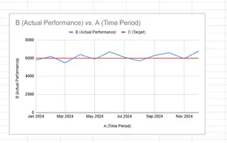
Method 3: Chart Reference Lines (For Data Visualization)
Adding lines to charts makes trends crystal clear:
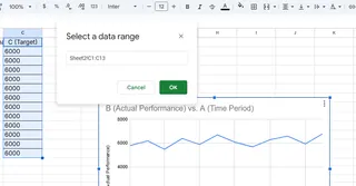
- Right-click your chart → Select Data

- Add a new series with your target value
- Change this series to a line format

With Excelmatic's AI-powered charts, you can add reference lines automatically based on your data patterns - no manual calculations needed.
Method 4: Conditional Formatting (Smart Lines That Update)
Make lines appear automatically when data hits certain points:
- Select your data range
- Home → Conditional Formatting → New Rule
- Set your condition (e.g., "=A1>1000")
- Choose border formatting
Excelmatic takes this further with dynamic formatting that adjusts as your data changes - perfect for dashboards.
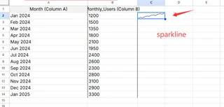
Method 5: Sparklines (Mini Visualizations)
Tiny charts that pack a punch:
- Insert → Sparklines → Line
- Select your data range
- Customize to show key thresholds

Pro Tips for Maximum Impact
- Use contrasting colors (dark lines on light backgrounds)
- Vary line thickness to show importance
- Keep styles consistent across your workbook
- Combine methods for complex visualizations
Beyond Basic Lines: Excelmatic's Smart Approach
While these manual methods work, Excelmatic users enjoy:
- One-click horizontal line insertion
- AI-suggested line placement based on data patterns
- Template libraries for common line types
- Automatic updates when data changes
Why spend time manually drawing lines when AI can do it smarter? Excelmatic analyzes your data structure and suggests optimal placement for maximum clarity.
Your Turn to Try
Next time your spreadsheet needs structure, try one of these methods. Start with simple borders, then experiment with more advanced techniques as you get comfortable.
Remember: Great data visualization isn't about fancy graphics - it's about clear communication. Horizontal lines are simple tools that make complex information instantly understandable.
Want to take your Excel skills further? Excelmatic's AI assistant can teach you these tricks and dozens more - turning spreadsheet headaches into "aha!" moments. Why not try it free today?


