As a User Growth Manager at Excelmatic, I constantly see how visual benchmarks drive better business decisions. Adding goal lines to Excel charts is one of the most effective—yet underutilized—ways to make your data tell a compelling story.
Why Goal Lines Matter
Goal lines transform raw data into actionable insights by:
- Providing instant context - See performance against targets at a glance
- Highlighting gaps - Quickly identify underperforming periods
- Focusing attention - Guide viewers to what matters most
While Excel offers manual methods, modern AI tools like Excelmatic automate this process while adding powerful analytics capabilities.
Manual Method: Adding Goal Lines in Excel
Step 1: Structure Your Data Correctly
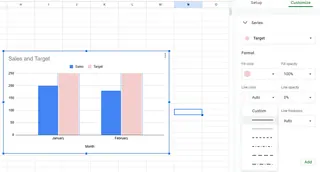
Create a dedicated goal column with your target values repeated for each data point:
| Month | Sales | Target |
|---|---|---|
| January | 200 | 250 |
| February | 180 | 250 |
Step 2: Create Your Base Chart
- Select your data range (including the Target column)
- Go to Insert > Charts
- Choose a line or column chart

Step 3: Customize the Goal Line
Right-click the target line to:
- Change to a dashed/dotted style
- Adjust color/thickness for visibility
- Add data labels

The Modern Alternative: AI-Powered Goal Tracking
While Excel's manual method works, platforms like Excelmatic revolutionize this process by:
✅ Automatically detecting and visualizing targets - No manual column setup required
✅ Updating in real-time - Connect directly to live data sources
✅ Adding predictive analytics - Forecast performance against goals
Here's how Excelmatic simplifies goal tracking:
- Import your dataset (Excel, Google Sheets, or database connections)
- Select "Add Benchmark" and specify your target value
- The AI generates an interactive dashboard with:
- Dynamic goal lines
- Performance alerts
- Variance calculations
When to Use Each Approach
Use Excel manually when:
- Working with static reports
- Needing simple one-time visualizations
Upgrade to Excelmatic when:
- Managing multiple KPIs
- Requiring real-time updates
- Sharing dashboards with stakeholders
Pro Tip: Make Goal Lines Actionable
Simply showing targets isn't enough—the best visualizations:
- Use contrasting colors (red for below target, green for above)
- Include variance percentages
- Add trend arrows
Excelmatic's AI automatically applies these best practices while letting you customize every element.
Conclusion
Goal lines transform data from informative to impactful. While Excel provides basic functionality, AI tools like Excelmatic take this to the next level with automation, real-time updates, and advanced analytics.
Ready to upgrade your data visualization? Try Excelmatic free to experience AI-powered goal tracking that saves hours of manual chart tweaking.


