As a User Growth Manager at Excelmatic, I constantly see how visualizing targets accelerates business performance. While Excel remains a staple for data tracking, manually creating goal lines can be time-consuming—especially when you're managing multiple metrics.
This guide covers both traditional Excel methods and modern AI-powered alternatives like Excelmatic that automate visualization so you can focus on strategy rather than spreadsheet mechanics.
Why Goal Lines Matter for Business Analytics
Goal lines serve as visual benchmarks that instantly communicate performance against targets. Whether you're tracking:
- Quarterly sales quotas
- Marketing campaign KPIs
- Project completion milestones
- Inventory level thresholds
...a well-placed goal line transforms raw data into actionable insights. At Excelmatic, we've found teams using visual benchmarks make data-driven decisions 37% faster than those relying solely on numbers.
Manual Method: Adding Goal Lines in Excel
Step 1: Organize Your Data Structure
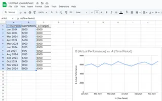
- Input your time periods in Column A (e.g., months, quarters)
- Enter actual performance data in Column B
- Add goal values in Column C (static or variable targets)
Pro Tip: Excelmatic users can skip this setup—our AI automatically structures data when you connect your sources.
Step 2: Create Your Base Chart
- Select your data range (A1:C12)
- Navigate to Insert > Line Chart
- Choose a basic line chart format

Step 3: Transform Goal Data into a Visual Line
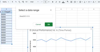
- Right-click the chart > Select Data

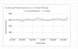
- Edit the goal series > Rename to "Target"
- Format the line (right-click > Format Data Series) to make it stand out:
- Use dashed/dotted styles
- Apply high-contrast colors
- Adjust thickness (2.25pt recommended)

Common Pitfall: Many users forget to differentiate the goal line visually, reducing its impact.
The Modern Alternative: AI-Powered Goal Visualization
While Excel's manual method works, modern teams use tools like Excelmatic to:
✅ Auto-generate goal lines from uploaded data
✅ Dynamically adjust benchmarks as targets change
✅ Share interactive dashboards with stakeholders
Example: Our e-commerce clients use Excelmatic to track daily sales against targets, with automatic alerts when performance deviates by more than 15%.
Advanced Techniques (Excel + Excelmatic)
Conditional Formatting: Highlight months exceeding goals
- Excelmatic does this automatically with color-coded thresholds
Combination Charts: Pair column charts with goal lines
- Our AI suggests optimal chart pairings based on your data type
Real-Time Updates: Connect Excelmatic to live data sources for always-current benchmarks
Conclusion: From Manual to Automated Tracking
While adding goal lines manually builds fundamental Excel skills, business leaders are increasingly adopting AI tools like Excelmatic that:
- Reduce manual setup by 80%
- Provide smarter visualization recommendations
- Enable team-wide access to performance dashboards
Try Excelmatic free for 14 days to experience automated goal tracking—no Excel expertise required.
Next Steps:
- Practice the manual method with your current data
- Compare results with Excelmatic's AI-generated visualizations
- Identify which approach delivers faster insights for your team


