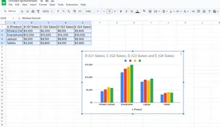
As a User Growth Manager at Excelmatic, I’ve seen firsthand how small design tweaks—like adding borders to charts—can elevate data presentations from "good enough" to "boardroom-ready." While Excel offers manual customization, modern teams are turning to AI-powered tools like Excelmatic to automate formatting and focus on insights.
In this guide, I’ll walk you through the traditional steps to add borders in Excel, then show how Excelmatic streamlines the process with AI-driven styling.
Why Borders Matter in Data Visualization
Borders might seem minor, but they play a key role in:
- Clarity: Defining chart boundaries helps audiences focus on the data.
- Professionalism: A crisp border signals attention to detail.
- Branding: Match borders to your company’s color scheme for cohesive reports.
Pro Tip: Tools like Excelmatic apply borders and other design best practices automatically, saving hours of manual tweaking.
Step 1: Select the Right Chart Type
Before styling, choose a chart that fits your data:
- Bar/Column Charts: Compare discrete categories (e.g., quarterly sales).
- Line Charts: Show trends over time (e.g., monthly growth).
- Pie Charts: Highlight proportions (e.g., market share).

Excelmatic Advantage: Our AI suggests the optimal chart type based on your dataset, eliminating guesswork.
Step 2: Insert Your Chart in Excel
- Select your data range.
- Go to Insert > Choose your chart type.
- Click to place the chart in your worksheet.

Step 3: Add a Border (Manual Method)
- Select the Chart: Click anywhere on the chart to activate it.
- Open Format Pane: Right-click > Format Chart Area.
- Customize the Border:
- Color: Match your brand or report theme.
- Style: Solid, dashed, or weighted lines.
- Width: 1-3 pts for balance.
Time-Saver: Excelmatic applies borders and cohesive styling across all charts in a dashboard with one click.
Pro Customization Tips
- Shadow Effects: Add depth via Format Pane > Effects.
- Rounded Corners: Soften edges for modern aesthetics (under Border Options).
- Consistency: Use the same border style across all charts in a report.
Beyond Borders: Automate Chart Styling with AI
While Excel’s manual tools work, Excelmatic transforms the process:
- Upload Data: Connect spreadsheets or databases.
- Describe Your Goal: e.g., “Show sales trends with professional borders.”
- Get AI-Designed Charts: Perfectly styled visuals in seconds, borders included.
Why It’s Better: No more clicking through menus—our AI handles formatting while you analyze results.
Final Thoughts
Borders are a small detail with outsized impact. For one-off charts, Excel’s manual method suffices. But for teams creating reports at scale, Excelmatic’s AI-driven approach ensures consistency, saves time, and elevates data storytelling.
Ready to upgrade your data visuals? Try Excelmatic free today and let AI handle the design heavy lifting.


